
How to improve your Calls-to-Action
Web Design

Mar 14, 20234 min read

How to improve your Calls-to-Action

Cade Biegel
Cade Biegel

As a SaaS company, your website's calls-to-action are an integral part of the customer experience. They should captivate and persuade users to take some sort of action that will benefit both the user and your business. However, crafting effective CTAs isn't always easy. Companies often struggle to create compelling CTAs that lead to desired outcomes. If you’re not sure how you can improve your website's CTAs, this post is for you! Here we will explore best practices for creating powerful calls-to-action and share strategies on optimizing them so they drive more conversions no matter what type of business you run or where in the funnel each CTA appears. Keep reading to learn our key tips on how to make your website’s calls-to-action as persuasive and successful as possible!

Don't use vague wording

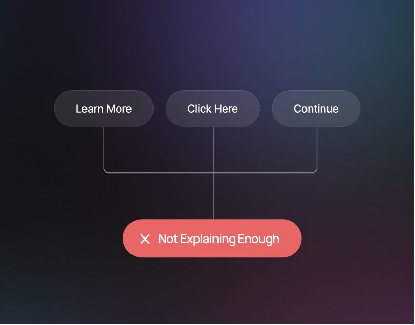
We've all seen the infamous "Learn More" CTA button. A CTA like "Learn More" doesn't actually let the user know where this button is going to take them. Including vague call-to-action (CTA) buttons on your SaaS website can be detrimental to the overall user experience. Vague wording does not provide any context to the user about what action should be taken next, thus leaving them feeling confused and uncertain. Furthermore, a lack of clarity in your CTA buttons could lead to low click-through rates, which in turn could decrease conversion rates. Using specific, clear language for your CTA buttons is essential for creating an intuitive experience that encourages customers to take the desired action. Clear CTAs are more likely to be understood by users and inspire confidence in their decision-making. They’re also more likely to increase engagement levels, as users can easily understand what they need to do and why they need to do it.  In short, including clear and specific CTAs on your SaaS website will greatly improve the user experience and increase customer engagement and conversions.
Make sure the CTAs are prominent and clearly visible

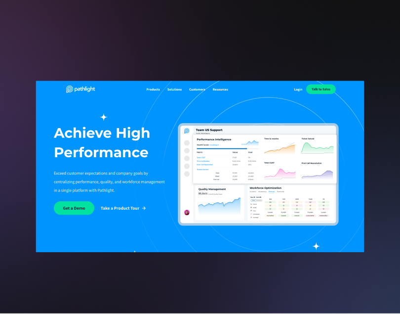
By making your CTAs prominently visible and strategically placed, your website can better encourage users to take the desired action. For example, placing CTAs above the fold on the homepage ensures that visitors will encounter them right away, giving them a chance to click on them immediately without scrolling or searching for them. Similarly, placing CTA buttons at the bottom of key pages allows you to reinforce engagement at moments when visitors have already read through the content and are more likely to act on it. Additionally, having several CTA options on different parts of your webpage also allows users to locate them easily regardless of where they are located on the site. Consequently, having clear and prominent CTAs strategically placed throughout your website can help you drive user engagement rates and ultimately increase conversions.
Be Clear

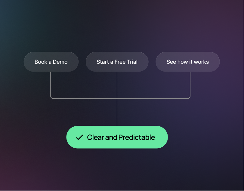
When designing the call to action (CTA) buttons for your SaaS website, it is important that you use clear and straightforward language such as “book a demo”. This will help ensure that potential customers have a better understanding of what they should do when they click on the button. Clear and straightforward wording also helps to improve user experience, as customers are more likely to take action when they understand what they are supposed to do. Furthermore, using clear and straightforward language can help you to stand out from competitors who may require multiple clicks or additional explanation before the customer can understand how to proceed. Additionally, studies have shown that buttons with more concise messaging tend to perform better than those with long-form messaging, which often leads to higher conversion rates and greater overall success for your website. Finally, by utilizing clear and straightforward language in your CTA buttons, customers will be less likely to become confused or frustrated when trying to interact with your website. This then leads to positive customer experiences that result in increased brand loyalty and an improved reputation for your SaaS company over time.
Use a strong color with plenty of contrast for your CTAs

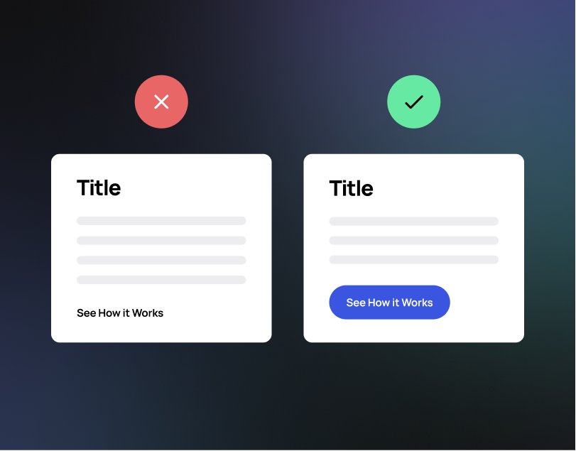
Using a strong color with plenty of contrast for your CTA buttons is an essential part of creating a successful website. Contrasting colors help draw the user's eye to the call-to-action and make it stand out from the rest of the page, increasing visibility and helping them find the button they need to click. Additionally, studies have shown that contrast can even improve user engagement, as people are more likely to interact with elements that stand out on the page. When used correctly, strategic color choices can help guide users toward completing desired tasks on your site more easily. Furthermore, when picking a color for your CTA buttons make sure to consider how it relates to other elements on the page in order to create a cohesive look and increase usability. For instance, if you have multiple links or buttons present on one page you may want to use different shades of the same color for each CTA in order to clarify which action is associated with each element. Overall, using a strong color with plenty of contrast can be incredibly effective in making your website’s CTAs stand out and improving overall user experience.
Ready for a conversion-optimized SaaS site?

Your website’s call-to-actions are one of the most important elements when it comes to increasing your conversion rate. By ensuring that your CTAs are well-designed and placed optimally, you can encourage your visitors to take action on your site, resulting in more leads and sales. If you’re ready for a high-converting B2B website design, book a call with us today – we’d love to help you get started!

About The Author

Cade Biegel
Cade Biegel, co-founder of Amply, leverages his expertise in design, CRO, SEO, and storytelling to drive accelerated growth for B2B brands through captivating websites and marketing techniques.
Want to work with Amply?
Book a Call
Let's work together!

Schedule a call with us to start your brand's trip to the stars...or maybe just to talk shop 😉

Cade Biegel

Cade Biegel

Co-founder @ Amply
Luke Lewis

Luke Lewis

Co-founder @ Amply

How to improve your Calls-to-Action

Cade Biegel
Cade Biegel
|
March 14, 2023
4
min read
How to improve your Calls-to-Action

As a SaaS company, your website's calls-to-action are an integral part of the customer experience. They should captivate and persuade users to take some sort of action that will benefit both the user and your business. However, crafting effective CTAs isn't always easy. Companies often struggle to create compelling CTAs that lead to desired outcomes. If you’re not sure how you can improve your website's CTAs, this post is for you! Here we will explore best practices for creating powerful calls-to-action and share strategies on optimizing them so they drive more conversions no matter what type of business you run or where in the funnel each CTA appears. Keep reading to learn our key tips on how to make your website’s calls-to-action as persuasive and successful as possible!

Don't use vague wording

We've all seen the infamous "Learn More" CTA button. A CTA like "Learn More" doesn't actually let the user know where this button is going to take them. Including vague call-to-action (CTA) buttons on your SaaS website can be detrimental to the overall user experience. Vague wording does not provide any context to the user about what action should be taken next, thus leaving them feeling confused and uncertain. Furthermore, a lack of clarity in your CTA buttons could lead to low click-through rates, which in turn could decrease conversion rates. Using specific, clear language for your CTA buttons is essential for creating an intuitive experience that encourages customers to take the desired action. Clear CTAs are more likely to be understood by users and inspire confidence in their decision-making. They’re also more likely to increase engagement levels, as users can easily understand what they need to do and why they need to do it.  In short, including clear and specific CTAs on your SaaS website will greatly improve the user experience and increase customer engagement and conversions.

Make sure the CTAs are prominent and clearly visible

By making your CTAs prominently visible and strategically placed, your website can better encourage users to take the desired action. For example, placing CTAs above the fold on the homepage ensures that visitors will encounter them right away, giving them a chance to click on them immediately without scrolling or searching for them. Similarly, placing CTA buttons at the bottom of key pages allows you to reinforce engagement at moments when visitors have already read through the content and are more likely to act on it. Additionally, having several CTA options on different parts of your webpage also allows users to locate them easily regardless of where they are located on the site. Consequently, having clear and prominent CTAs strategically placed throughout your website can help you drive user engagement rates and ultimately increase conversions.

Be Clear

When designing the call to action (CTA) buttons for your SaaS website, it is important that you use clear and straightforward language such as “book a demo”. This will help ensure that potential customers have a better understanding of what they should do when they click on the button. Clear and straightforward wording also helps to improve user experience, as customers are more likely to take action when they understand what they are supposed to do. Furthermore, using clear and straightforward language can help you to stand out from competitors who may require multiple clicks or additional explanation before the customer can understand how to proceed. Additionally, studies have shown that buttons with more concise messaging tend to perform better than those with long-form messaging, which often leads to higher conversion rates and greater overall success for your website. Finally, by utilizing clear and straightforward language in your CTA buttons, customers will be less likely to become confused or frustrated when trying to interact with your website. This then leads to positive customer experiences that result in increased brand loyalty and an improved reputation for your SaaS company over time.

Use a strong color with plenty of contrast for your CTAs

Using a strong color with plenty of contrast for your CTA buttons is an essential part of creating a successful website. Contrasting colors help draw the user's eye to the call-to-action and make it stand out from the rest of the page, increasing visibility and helping them find the button they need to click. Additionally, studies have shown that contrast can even improve user engagement, as people are more likely to interact with elements that stand out on the page. When used correctly, strategic color choices can help guide users toward completing desired tasks on your site more easily. Furthermore, when picking a color for your CTA buttons make sure to consider how it relates to other elements on the page in order to create a cohesive look and increase usability. For instance, if you have multiple links or buttons present on one page you may want to use different shades of the same color for each CTA in order to clarify which action is associated with each element. Overall, using a strong color with plenty of contrast can be incredibly effective in making your website’s CTAs stand out and improving overall user experience.

Ready for a conversion-optimized SaaS site?

Your website’s call-to-actions are one of the most important elements when it comes to increasing your conversion rate. By ensuring that your CTAs are well-designed and placed optimally, you can encourage your visitors to take action on your site, resulting in more leads and sales. If you’re ready for a high-converting B2B website design, book a call with us today – we’d love to help you get started!

About The Author

Cade Biegel
Cade Biegel, co-founder of Amply, leverages his expertise in design, CRO, SEO, and storytelling to drive accelerated growth for B2B brands through captivating websites and marketing techniques.
Let's work together!

Schedule a call with us to start your brand's trip to the stars...or maybe just to talk shop 😉

Cade Biegel

Cade Biegel

Co-founder @ Amply
Luke Lewis

Luke Lewis

Co-founder @ Amply