

Want to spice up your website beyond the ordinary? Webflow is all you need.
Webflow’s powerful visual builder and drag-and-drop interface lets you give life to your most creative, standout website visions.
Webflow allows you to realize your web design potential and create a website that beautifully reflects your brand identity, without needing any coding experience.

Building websites with Webflow CMS is easy. Major brands across various industries trust Webflow's web design prowess (Webflow templates, no-code visual website builder, CMS, integrations, cloneable sites, endless customizable features, and so much more) to power their custom websites–online stores, membership sites, lively blogs, and portfolios.
Check out these 21 incredible custom websites built with Webflow CMS for your own design inspiration.
21 Best Webflow Website Examples
Webflow websites come in all flavours and niches. Although these are not exactly open-source, cloneable sites, we have handpicked 20 of the most attractive Webflow examples for design inspiration.
Jasper.ai

Jasper.ai is an AI tool that helps you create content, like marketing copy, social media posts, and even creative text form formats. It uses AI to understand your requests and generate different creative text formats of text content.
Jasper.ai's website seriously looks the part! It's got this creative, modern design that just works. The color palette, especially that vibrant purple with hints of blue and pink, feels incredibly fresh. They've nailed the use of space, making it effortless to navigate and engage with their content.
But it's not just focusing on the looks—the organization is spot-on as well. Clear headings guide you through exactly what this AI writing tool offers. And their content? It's top-tier, hitting you with the value right from the start.

Functionality-wise, Jasper.ai ticks all the boxes. Navigation is a breeze, with the menu staying accessible as you scroll. The blog and resource section shows they're invested in helping people understand AI writing, which builds trust.
Bonus points for the technical stuff too–they're on top of their security and SEO game. Overall, Jasper.ai sets a high bar for blending stunning web design, user-friendly experience, and savvy content strategy.
Simondata.com

Amply, a Webflow website development agency, recently redesigned Simondata's website. And oh boy, what a redesign!
Simondata’s hero section showcases their software, which helps CRM teams improve customer personalization. The main banner boldly states, "The Snowflake CDP for Marketing Teams," emphasizing their focus on marketing teams using Snowflake software for personalized analytics.
They even highlight "marketing teams" in pink to draw attention to it. Their call-to-action prompts visitors to request a demo, making it easy to sign up and receive a demo directly in their inbox. The website features happy customer images and examples of personalization to illustrate their product's benefits.
They also proudly display logos of companies they've worked with to build credibility. The navigation is user-friendly, making it easy to explore their offerings.
Anvilogic

Anvilogic is a cybersecurity company that offers a cloud-based security platform. The firm helps security teams find threats across their different systems and data lakes, and respond to them more efficiently.
Anvilogic’s crushes website copy by adressing customer pain points while also showcasing their USP. The "Break Free from SIEM Lock-In" headline instantly captures attention, especially for anyone in the security operations world.

It's smart how they focus on numbers throughout the site – 80% savings, 30,000 hours, and so on; that's way more impactful than just fluffy marketing talk. Any security team can immediately see the potential value there.

But what we really like is the "Resources" section. It's packed with in-depth content on security trends and best practices. That shows Anvilogic isn't just trying to sell but also build authority and trust.
Ramp

Ramp offers financial tools for businesses, specifically focused on spending management. They give out corporate cards, automate expense reports, and streamline bill payments–all in one platform.
Ramp's website gets the job done, and honestly, it looks good doing it! Their color scheme is crisp–white and green for a classic feel, then pops of neon add a bit of life and energy. The CTA buttons are specifically a bright green shade to guide visitors to action.

The font is clean and easy to read on all screen sizes; that stuff matters! And how about big, bold headlines? They have also added Google reviews on the hero section as a testimonial to their amazing services.
Another thing Ramp gets right is easy navigation. You're not wasting time trying to figure out where to click. Plus, logos of big-name companies they work with? That's a trust builder right there.
From a design perspective, Ramp's website is a win. It's a creative example of how a website can be clean, informative, and still have a bit of personality.
TestFit

Testfit is a real estate feasibility platform designed for developers, architects, and contractors. They use AI to automate tasks such as site planning and design iteration to find the most profitable options for development projects quickly.

TestFit's website is like a well-designed template: efficient, purposeful, and visually striking. Their monochromatic palette with splashes of blue and orange screams sophistication and mirrors the precision of architectural work.
From the get-go, that hero section hits you with: "Set Your Sites on Better Feasibility". It's a power move, immediately telling you what they're about. Love how they follow up with the AI angle–in this industry, that's a major selling point.
The navigation couldn't be easier; neatly placed CTA buttons and post to product pages, resources, and more. And let's talk about integrations! TestFit knows its audience–Revit, Enscape, and all the big players are mentioned. Plus, being able to work with SketchUp and AutoCAD... that's functionality multi-fold right there.
Our favourite design inspiration? The 3D visuals. Architects and developers are visual thinkers – showing the software in action is way more impactful than just describing it.
TestFit site is among the best Webflow examples of how "less is more" can truly land your message and resonate with your target audience.
Dock

Dock.us is designed to improve the sales process, especially for B2B interactions. It helps with tasks like creating proposals, managing customer onboarding, and providing sales reps with tools to collaborate with clients.
Dock.us has used Webflow’s customizable drag-and-drop interface to its full potential. The hero image is a cartoon depiction of a typical workplace look to build a connection with the visitors. What it does right is it puts all you need to know about Dock right in the hero section. The prominent “Get Started” and “Request Demo” CTA buttons do their part in encouraging visitor engagement.
Scroll down and you’ll be guided through all the features that make Dock stand out from the rest.

The website has placed the logos of well-known corporations along with video testimonials. This establishes Dock as a leading authority among competitors.
Moving on, the navigation is also remarkably intuitive for this website. Working in conjunction with the design, clear and concise language portrays the Dock web design in a very appealing light.
Riverside

Riverside.fm is an online platform for recording high-quality podcasts and videos. It allows you to record with multiple guests remotely and allows local recording for clear audio even with a weak internet connection.
Riverside.fm's website feels both approachable and polished. It's inviting without being overly playful, striking the right balance for a tool aimed at podcasters and content creators.
Layout-wise, they've done a great job keeping things simple. Each section or single page flows smoothly into the next, with plenty of space for the text to stand out. It's the kind of website where you can find what you need without feeling overwhelmed.

We particularly like their use of visuals. They show screenshots of the software in action but also showcase diverse people using Riverside. That sends a subtle message that this platform is for everyone, from seasoned pros to just starting out.
The homepage headline is a winner: "Studio-quality recording, anywhere". It immediately tells you what Riverside does and the big benefit they offer. The navigation is super straightforward too–no getting lost in menus here. The site creates a modern vibe that makes you want to give their recording platform a try.
Trala

Trala is a platform designed to help you learn violin, whether you're a complete beginner or looking to brush up on your skills.
With Trala’s site, the focus was on creating a user experience that mirrors the grace and timelessness of violin music. The design philosophy centers around minimalism and a focus on the user journey.
Additionally, the site uses a soft color palette with subtle gradients to arouse warmth and a feeling of refinement.
Trala's website is all about smooth sailing when it comes to finding your way around. They've nailed a clean visual hierarchy and tidy layouts, making it super easy to navigate.

The animated calls to action stand out just right—clear but not in your face. Plus, the web designers here have left plenty of breathing room with whitespace, so you never feel overwhelmed by content. Trala's goal with their website? To make learning a new instrument feel less daunting and more inviting.
Heretto

Herreto helps businesses create and manage exceptional content experiences. They offer a platform specifically designed for deploying documentation and developer portals that engage and delight potential customers.
Heretto's website puts a fresh spin on the classic corporate look. Their cool blues, crisp whites, and pops of orange signal both trustworthiness and innovation. The lettering and typeface feels clean-cut–perfect for skimming on any screen size. It's a smart move prioritizing readability in a tech-focused space.
The large text instantly gives away the USP to visitors. Subtle animations keep them engaged. You can tell the designers carefully crafted a journey that's both informative and visually pleasing. Calls to action are impossible to miss, which is a big plus in our book!

From a functionality standpoint, this site gets an A+. Pages load lightning-fast, and the navigation feels natural. It's the kind of website where you find what you need without even thinking about it.
Heretto's website strikes a great balance between looking sharp and being a breeze to use. That's the mark of excellent Webflow web design!
Chili Piper

Chili Piper is a software tool for B2B sales teams that streamlines scheduling and lead conversion.
Chili Piper's website is another great example of a beautifully designed Webflow website. You'll notice they use the color red strategically. It's in their logo and on key elements like the call-to-action button. This red hue ties back to their brand name, "chili," creating a strong association that sticks with customers. It's a smart choice that helps reinforce their brand identity and makes their site memorable and engaging.
Lettering is bold, almost like they're shouting their headlines and making sure you pay attention.

The site also has a demo video on the hero section which hooks the visitors and makes them want to explore the product further. Plus, little animations are a nice touch–adds a bit of playfulness.
The navigation is a little quirky. You've got the usual menu at the top, but some pages also have a floating sidebar. It's different, but honestly, makes it easier to find stuff when you're scrolling. The Chili Piper website shows they know how to use Webflow to their advantage; they walk the line between professional presentation and having some fun with their brand.
Cycle

Looking for a way to gather customer insights, Cycle acts as an autopilot feedback hub. It automatically collects feedback from various sources and organizes it for easy analysis.
Cycle's Webflow website has a clean, almost futuristic aesthetic. It's heavy on white space, with a crisp blue as the primary accent color. This combination creates a sense of focus and efficiency, which is fitting for a product aimed at streamlined product management.
The lettering on the site is a perfect blend of modern and approachable. They use a sans-serif font for headings and a slightly more playful one for body text. It keeps things professional, but not overly stiff.
Cycle does a stunning job of balancing visuals and text. They've got some subtle animations that catch the eye without being distracting, plus screenshots that clearly demonstrate the software's capabilities. The content itself is focused and to the point – they highlight the pain points of traditional product feedback and how Cycle solves them.

The main menu is clear, and they cleverly use a sticky sidebar for easy access to more detailed information as you scroll. It's a small detail that makes a big difference in user experience. Cycle's website is the perfect reflection of their product: well-designed, intuitive, and focused on helping teams work smarter.
Clay

Clay caters to sales and marketing teams. It helps them improve outreach efforts by enriching contact data and automating personalized messages.
First impression? Clay’s website is sleek and sophisticated. They use a color palette focused on deep blues and teals with crisp white and the occasional vibrant yellows. This feels professional yet modern–a great fit for their target audience. The simplistic font family in use echoes this vibe, along with large, impactful headers and body text that's super-readable.
The hero section does a great job of hooking you in. "Scale Personalized Outbound"(meta) is a bold declaration, followed by clear and concise copy. They clearly understand their value proposition and aren't afraid to lead with it.
Scrolling down, the layout uses a lot of negative space to give each page and section room to breathe: a smart way to keep it all feeling airy and not cluttered.

Visually, Clay's website mixes subtle graphics with clean blocks of color. The design team knows when to add visual interest and when to let the content speak for itself.
Navigation is intuitive; you've got the standard top menu, but they also include that floating sidebar menu for when you get deeper into longer pages. It's a bit of a unique touch that adds to the user-friendliness.
Clay's website gives off the impression of a polished, well-thought-out piece of work. It's a great example of how to use Webflow for a strong brand presence without going overboard with design bells and whistles.
Synthesia

Synthesia lets users create realistic videos using artificial intelligence. Right off the bat, a lot is going on visually in Synthesia’s website.
They hit you with bright colors, dynamic animations, and a whole range of video examples showcasing their AI tech. It's attention-grabbing, but it does run the risk of feeling a tad busy.
We feel that they want to convey a playful, cutting-edge vibe, which they do, but some folks might find it a bit intense.

Typography-wise, it's a bit of a mixed bag. The headers are big and bold, which we like. But the body text is smaller and the choice of font makes it a bit harder to parse at a glance. Navigating the site is straightforward enough; the top menu is standard. But they've tucked some additional links into the footer section as well, which could take users a moment to find.
Where Synthesia's site truly shines is its use of interactive elements. The video demos demonstrating their AI avatars in action are well done.
It's a much more impactful way to show off their tech than simply describing it in text. Functionally, the site feels well-optimized; pages load fast and the video integrations are smooth.
Synthesia's website has both strengths and weaknesses. They've invested in making their tech the star of the show. However, from a user-experience standpoint, there's room to streamline the visuals and focus on the key messages they want to convey.
Pave

Pave is a data-driven compensation platform with end-to-end total compensation and benefits management abilities.
First off, Pave's website feels clean and approachable. Their color palette is bright and fresh, with a dominant green balanced by cool blues and crisp white. It gives the site a sense of energy and trustworthiness–a good combo for a compensation management platform.
The font family used is simple and easy to read. They've chosen a no-nonsense sans-serif font, which makes skimming content a breeze.
The layout is another strength. It's got a clear visual hierarchy, with big impactful headlines, concise body text, and well-placed calls to action that don't feel pushy. We like how they use graphics and illustrations to break up content and add visual interest.

From a navigation standpoint, it's very straightforward. The top menu has key links users expect –product info, pricing, resources, etc. It's the kind of website where you don't have to think too hard about where you want to go: a big plus in my book.
One thing that stands out to us is the animations. They're subtle but well-executed. They add a touch of polish without overwhelming the design. Pave's website is a solid example of a functional and visually appealing business site. They've put effort into crafting a user experience that's both informative and easy on the eyes.
Bounti.ai

Bounti.ai is an employee learning platform, with gamified training, micro-learning modules, and reminders to keep deskless workers engaged and up-to-date.
Color-wise, Bounti.ai’s Webflow website leans on a palette of bright blues and purples, accented with pops of yellow and a vibrant green. It gives off a modern and energetic vibe–definitely in line with their focus on AI-powered sales tech. The lettering is clean and uncomplicated–a classic sans-serif that works well on all devices.
The hero section is strong, with a bold headline and concise supporting copy. They get right to the point about their value proposition, which is always a smart move. One thing we like is the use of testimonials throughout the site. It adds a nice layer of social proof, which builds trust with potential clients.

The layout is structured, with clear sections for different aspects of their platform. They've used a good mix of text, visuals, and even short videos to demonstrate how Bounti.ai works. Navigation is straightforward – clear links in the header take you where you need to go. I
Bounti.ai’s website strikes a nice balance between providing the key details and creating a visually engaging experience. That's important for a tech product–you want to hook people in with the look and feel before they even start reading!
Aura

Aura brings a suite of digital safety tools for individuals and families. They offer protection from identity theft, financial fraud, and online threats.
Aura's webflow website has a clean and calming aesthetic. They've used a lot of whitespaces, soft blues, and gentle gradients. Typeface is classic and easy on the eyes. They stick to a simple sans-serif font, which makes the content readable.
They immediately explain their value proposition through a services section and a well-structured hero section.. without overwhelming visitors with info. Visually, they mix subtle visuals with photos of real people to add warmth and reinforce that "family protection" angle.

As you scroll, the layout feels organized. They use well-defined sections to highlight different aspects of their service – identity theft protection, financial fraud monitoring, etc. Navigation is easy, with a clear top menu and a sticky bar that shows up for easy access to main links.
One thing we notice is their consistent use of iconography. They have custom icons accompanying different services, which helps visitors quickly grasp the concepts. Aura's Webflow website is a solid example of how to make a security-focused Webflow site feel approachable and user-friendly.
Pivot
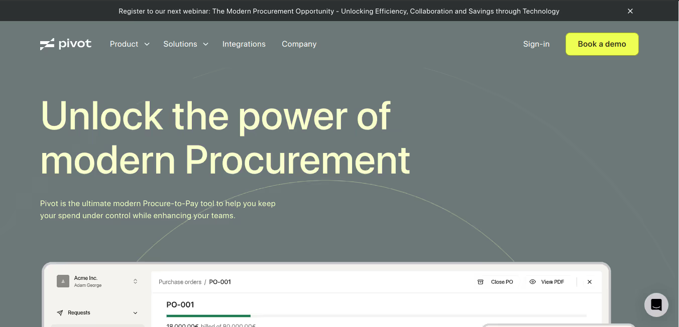
Pivot a cloud-based procurement platform designed to simplify and improve the "Procure-to-Pay" process for businesses
Right away, Pivot's website strikes us as modern and elegant. Their color palette is a blend of soft blues, a touch of purple, and crisp whites.
The hero section is strong, with a punchy headline ("Unlock the power of modern Procurement") that immediately tells you what they're about. We like how they follow up with concise blocks of text explaining the benefits of their platform. The layout is clean and uses negative space effectively, giving the content room to breathe.

Scrolling down, they use subtle animations to add a bit of dynamism to the site. It's not overdone, just enough to keep things visually interesting. Navigation is intuitive with a standard top menu. What's more impressive is the attention to detail–they have little animation on buttons and links, which adds a polished feel to the user experience.
Pivot's website demonstrates the importance of strong design for establishing a brand identity. Their site is a great example of how to balance functionality with a modern, visually appealing aesthetic.
Lavender

Lavender is an AI-powered email coach designed to help salespeople write better emails and get more replies
Lavender's website feels welcoming. They use a cheerful color palette with lots of light purples, soft blues, and a touch of sunny yellow. It sets a friendly tone right away. The playful lettering enforce their brand message: Email like it’s magic. .The description is concise and explains the value they offer.
One thing we like is the use of illustrations throughout the site. They add a playful touch and help break up the text. They use clear sections to explain different features and benefits.

From a technical standpoint, the site feels well-built. Pages load quickly, and the design adapts nicely to different screen sizes. Lavender's website has a polished and inviting presence. It's a good example of how to make a user-friendly and visually appealing Webflow site for a SaaS product.
Unknowngolf

Unknowngolf is a golf app with a ton of features, from social interaction to scorekeeping and tournament management. Unknowngolf’s website has a bold, almost rebellious feel. They use a golf course as a background image. The site’s lettering is big and impactful with lots of uppercase headers that grab your attention.
Website copy like “Play the game. Leave the rest to Our Golf App." show they're going for an edgy, unconventional vibe. This carries through the site, from product descriptions to their visuals.

One unique aspect is their use of video backgrounds. It adds a dynamic quality to the site, though it could be a bit much for some folks. It's clear they're targeting a younger, counter-culture golf crowd.
The Unknown Golf webflow website has a distinct personality. They understand their target audience and have designed a site that caters specifically to them. It might not be everyone's cup of tea, but it makes a strong, memorable impression.
Mymetasoftware

MyMeta Software helps businesses get the most out of their existing software by providing a user-friendly layer on top
My Meta Software's website has a clean, classic feel, with a muted color palette of blues, grays, and a touch of teal creating a sense of calmness and professionalism. In the hero section headline “Simplified Software, Better Business Outcomes”, the words “simplified” and “better” are highlighted. This draws the visitors attention and reinforces their simplification-dependent value proposition.
The hero section is well-structured with a clear headline that explains their value proposition. We like how they use simple language to describe their features and benefits. They make effective use of graphics and icons to break up the text and visually represent their service offerings.
The layout is balanced with ample whitespace, preventing the content from feeling overwhelming. Scrolling down, the site uses clear sections to guide visitors through their product line and customer success stories.

My Meta Software's website strikes us as functional and informative. It feels like a site where potential clients can easily find the information they need. While not the most cutting-edge in terms of design, its focus on clarity and usability is a smart approach for its target audience.
Lemlist

Lemlist is a sales outreach platform that helps with cold emailing and multi-channel campaigns.
Lemlist's website has a playful energy. It uses a distinct color palette with modern and whimsical fonts, giving the website a fun personality.
The headline ("The only cold outreach tool that helps you reach inboxes and get replies") hooks you right away. They follow up with clear, concise copy that explains the benefits of their innovative email outreach tool. We love their use of quirky illustrations throughout the site. They add a unique touch and reinforce Lemlist's approachable brand voice.

Lemlist's website feels well-designed and user-friendly. They've successfully created a website that reflects their playful branding while still being informative and professional. Their attention to detail is evident, an example of how to make a strong first impression in the SaaS space.
We hope these Webflow website examples have sparked an interest in you to flock to a website builder today and actualize your dream webflow websites.
Build Your Own Responsive Webflow Website Today
The 21 best Webflow websites we’ve listed above are proof of Webflow’s far-ranging capabilities. With a powerful website builder like Webflow, only your imagination is the limit. We hope these beautiful and distinct websites have fuelled your creativity to design your own awesome Webflow site.


.avif)


.avif)