Top 25 Cybersecurity Website Design Examples (2026)
Luke Lewis
May 27, 2026
15
min
Key Takeaways
Strong cybersecurity websites focus on clarity first. Visitors should immediately understand what the company does, who it is for, and why it matters.
Trust signals matter more than flashy design. Certifications, compliance badges, case studies, and real-world proof consistently show up on the best sites.
Good information architecture beats overloading pages. The best examples keep navigation simple and guide users toward key actions without friction.
Messaging is practical, not fear-driven. Top sites explain risks clearly but focus more on solutions and outcomes than scare tactics.
Design supports credibility, not creativity for its own sake. Clean layouts, restrained visuals, and consistent branding help reinforce reliability.
Conversion paths are intentional. Whether it is booking a call, downloading a report, or requesting a demo, CTAs are clear and easy to find.
Content is written for decision-makers. The strongest sites speak directly to CISOs, IT leaders, and executives instead of trying to appeal to everyone.
This is especially important in the cybersecurity world, where trust is the name of the game. After all, if you're promising to protect businesses and individuals from cyber threats—your website should reflect those qualities.
Gone are the days when aesthetics were the only parameter for people to judge your website’s quality. Your cybersecurity web design now needs to be a digital fortress.
It should be packed with top security features and have informative content that shows your expertise. Plus, it needs to be easily navigable for potential clients to find what they need.
Let's explore 25 examples of cybersecurity websites that demonstrate how web design can build trust, showcase expertise, and ultimately attract and convert clients.
What Makes a Great Cybersecurity Website Design?
Good cybersecurity website design isn't about looking impressive. It's about being understood. Security buyers are cautious, technical, and short on time. When they land on your site, they're not admiring the animations. They're quickly scanning to figure out what you do, who it's for, and whether you're credible enough to be worth their attention.
The first thing that separates a strong cybersecurity website from a forgettable one is clarity. Visitors, whether that's a CISO, an IT director, or a procurement lead, should immediately know what the company does and why it matters to them. Vague claims like "enterprise-grade security" or "built for modern threats" don't do that job. Specific messaging tied to real outcomes does.
Trust signals carry more weight here than in almost any other industry. Compliance badges, security certifications, recognizable client logos, and real case studies all tell a buyer that you've been vetted by people like them. These elements aren't decorations. They're doing active conversion work. The best cybersecurity sites layer proof throughout the page, not just at the bottom.
CTAs and conversion paths also need to be designed with the buyer in mind. Security decisions typically involve multiple stakeholders and long evaluation cycles. A "Book a Demo" button works when it's earned, meaning the visitor already understands enough to take that step. The best sites earn that click by giving decision-makers what they need to feel confident before they're asked to act. If you're looking for agencies that apply this thinking to cybersecurity websites, this list of cybersecurity website design agencies covers teams that understand how security buyers actually evaluate vendors.
Top 25 Cybersecurity Websites Examples
These amazing websites show that you don't need to be a large company with a huge budget to look professional online. They're sleek and engaging and prove that even small businesses and startups can create secure and visually appealing websites.
Here are the top cybersecurity websites that you can take inspiration from:
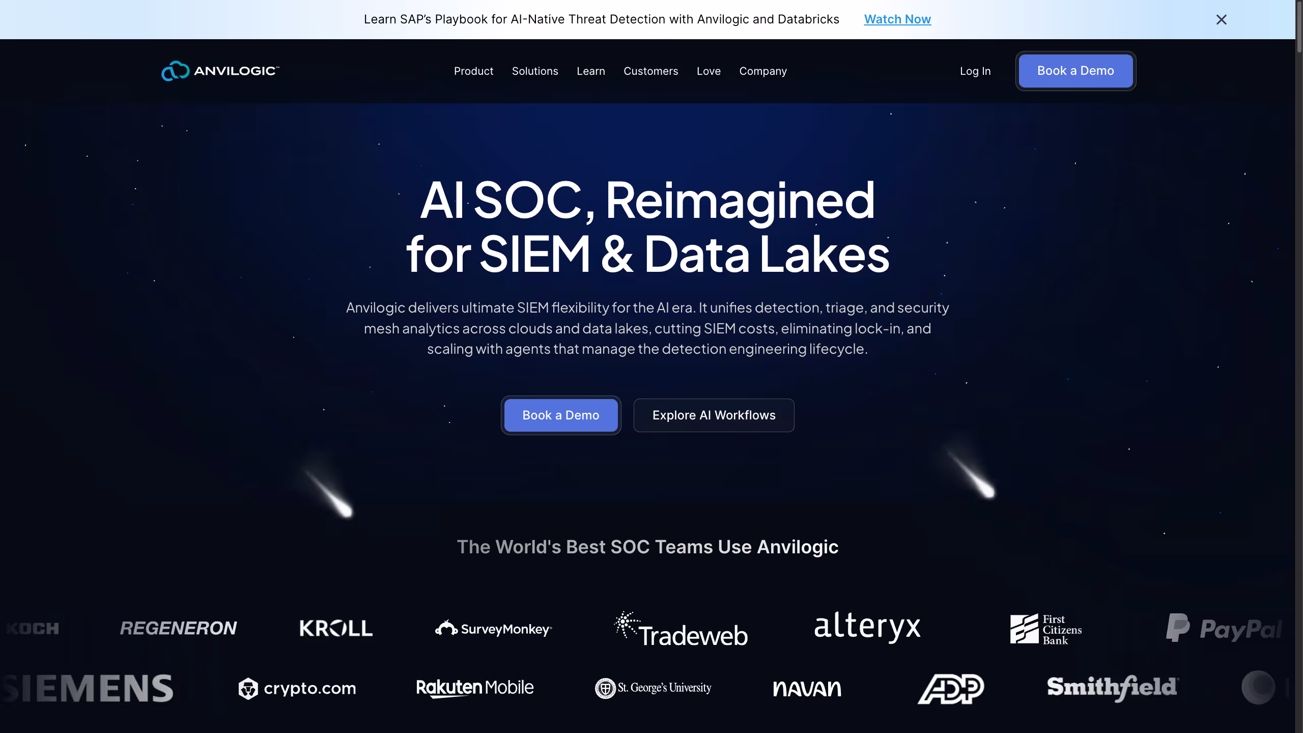
Anvilogic is a security analytics and detection engineering platform built for modern SOC teams operating across SIEMs and data lakes. It helps teams create, tune, and scale detections using AI-driven workflows, without locking them into a single vendor or rigid architecture. By running where security data already lives, Anvilogic reduces alert noise, lowers SIEM costs, and gives teams long-term control over how their detection logic evolves.
Their website mirrors this approach well. The redesigned site focuses on clarity, structure, and explaining a complex product in a way that security leaders can quickly understand. We broke down the thinking behind the redesign and what makes it work in this detailed teardown of the Anvilogic website, which looks closely at messaging, layout, and conversion flow.
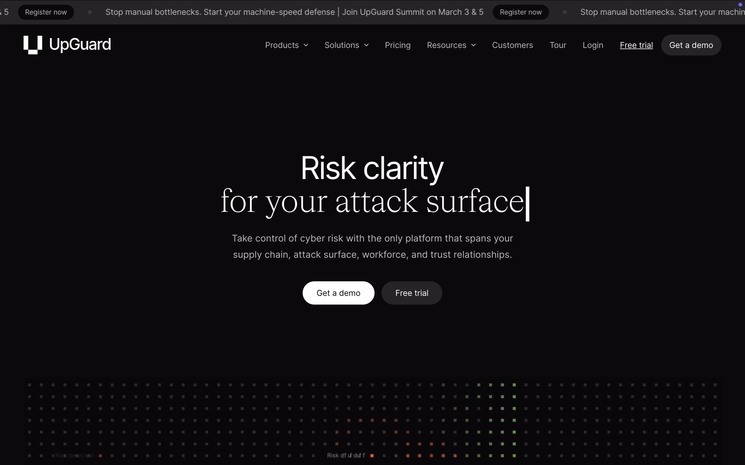
UpGuard’s website stands out for how clearly it communicates a complex cybersecurity platform. The headline focuses on “risk clarity,” positioning cybersecurity as a business priority rather than a technical checklist. The messaging quickly establishes that the platform spans vendor risk, attack surface, workforce risk, and trust relationships, helping buyers understand the breadth of the solution without overwhelming them. Real product screenshots appear early, which builds credibility and shows exactly what users can expect inside the platform.
The site also does a strong job of structuring its platform narrative. Instead of listing disconnected features, it presents a unified view of risk that feels organized and mature. Social proof is layered throughout the page with enterprise logos, customer results, and industry recognition, reinforcing trust as you scroll. UpGuard works because it balances executive-level positioning with tangible product proof, making it relevant for both decision-makers and technical evaluators.
3. Redline
Redline Cyber Security are experts at penetration testing and security assessments.
Right from the start, it has split sections—one side boldly announces, "Secure Your Business with Expert Pentesting," while the other side shows features the firm offers.
The bright crimson call to action button pops out on the dark background, making it impossible to miss. "Secure Your Business" placed strategically beneath the headline, instructs visitors to take immediate action.
As you scroll down, Redline introduces a series of eye-catching statistics about the escalating cyber threats faced by businesses today.
This serves a dual purpose. First, it educates visitors about the importance of cybersecurity.
Second, it positions Redline as a solution provider who understands the urgency of the issue.
Further scrolling down, they explain their process for checking your online defenses, demonstrating their service and ultimately attracting leads by building trust.
Priam Cyber AI simplifies cybersecurity operations with its advanced virtual analysis platform powered by AI.
Priam Cyber AI's website is a masterclass in minimalist design, using a dark background to create a sense of mystery and intrigue, a theme that relates to the world of cybersecurity. Against this backdrop, the bright, light blue call-to-action button, "Get Your Free Trial," pops out, inviting visitors to explore their offerings.
The hero section of the homepage is uncluttered and to-the-point. The headline, "Measure and Improve Your Security Operations," cleverly explains their product to cybersecurity professionals in merely six words!
The navigation bar at the top is clean and simple, guiding visitors to learn more about the company's approach, team, and the AVA platform itself. There's also a "Resources" dropdown menu, with helpful content like whitepapers and case studies.
Blackbird IT is a cybersecurity solutions firm based out of Australia. The company's website design echoes its core message “Driving Productivity with Technology.” This concise messaging shows their expertise and commitment to excellence.
The website uses a dark background with splashes of bright Neon. This not only looks cool but also gives you a feeling that Blackbird IT is a modern and powerful company.
In the bottom left corner, there's a badge that says they're a "Great Place to Work." This tells you they care about their employees, which is important for a company that wants to do good work for its clients.
As you scroll down, you can watch a video about what it's like to work at Blackbird IT. Further scrolling reveals a showcase of Blackbird IT's impressive client list, featuring logos of well-known companies they have worked with.
iothreat is a cybersecurity firm specializing in SOC2 compliance for startups. The website's design is simple yet effective, with a calming blue background that conveys trust and naked security. The big, bright "Get Started" buttons make it easy to learn more and try their services.
The navigation bar provides easy access to essential information about the company, its services, cybersecurity blogs, and contact details.
As you scroll down the page, you'll see a list of well-known companies that iothreat has worked with. Following this, the website shows the platform's features, outlining the benefits of their proprietary algorithms. This section aims to educate potential clients on how the company can help them achieve SOC2 compliance easily.
To further reinforce their expertise, the platform includes testimonials from satisfied clients.
Prove is a phone-based identity verification platform that helps businesses verify users and prevent fraud. The hero section is split into two parts. On the right, a slideshow showcases people happily interacting with their phones, symbolizing the seamless user experience that Prove enables.
On the left, the hero text boldly states, "The modern way of proving identity," immediately communicating Prove's value proposition. The subtext, "Trusted by 1,000+ leading companies to reduce fraud and improve consumer experiences," further explains Prove's credibility and track record.
The website's color scheme is mainly black and white that creates a clean and professional aesthetic look. As you scroll down the page, Prove shows its key features and benefits, emphasizing its accuracy, ease of use, and ability to reduce fraud.
Further down the page, Prove also includes case studies that highlight how their platform has been successfully implemented across various industries.
Torq is a no-code security automation platform designed to help security teams work smarter, not harder.
The hero section immediately captures attention with a video animation playing in the background. This animation showcases Torq's platform in action, demonstrating its ability to automate various security tasks and streamline workflows.
The text overlay on the hero image is concise and impactful.
The color scheme is predominantly dark. This creates a sophisticated and professional look that aligns with the cybersecurity industry. The dark background also helps to make the video animation and text elements pop, ensuring they are easily readable.
Wiz is a one-stop shop for keeping your company's cloud data safe. The homepage is split into two parts. On the right, there's a hand-drawn image of a globe (representing the cloud) gently held between two hands.
This friendly image suggests that Wiz is there to take care of your cloud security. The left side features a bold message: "Secure Everything You Build and Run in the Cloud." This clearly states what Wiz does, making it easy for even non-techies to understand.
The website mainly uses white and calming blue colors, creating a sense of trust and security. Two big, blue "Get a Demo" buttons stand out, inviting you to see how Wiz works in action.
As you scroll down, you'll see logos of big-name companies that trust Wiz to keep their cloud data safe. This shows that Wiz is a proven solution for businesses of all sizes. They also display reviews from popular software review sites, further highlighting their positive reputation.
Next, there's a fun interactive section with a nutcracker animation. When you click on it, you'll find different problems that development teams often face. This is a clever way to illustrate the cybersecurity challenges Wiz helps solve.
Just below the nutcracker, Wiz explains how their platform can be the solution to those problems. They don't get too technical here; they keep it simple so that anyone can understand the benefits.
Safetica is a trusted data loss prevention and insider risk management solution.
The hero section of the website is divided into two distinct sections. On the right, a rotating animation displays the core Safetica features—data loss prevention, insider risk management, cloud data protection, and compliance.
On the right, the hero text delivers a short yet impactful message: "Shield your data. Stop data leaks. Spot insider risks." These short, action-oriented phrases immediately communicate the urgency of data security threats and Safetica's ability to address them.
The website offers two distinct calls to action (CTAs), catering to different user preferences. The "Schedule a Demo" button appeals to those who prefer a personalized walkthrough of the platform's features. Conversely, the "Take a Product Tour" button allows users to explore the platform at their own pace, offering a more self-guided approach.
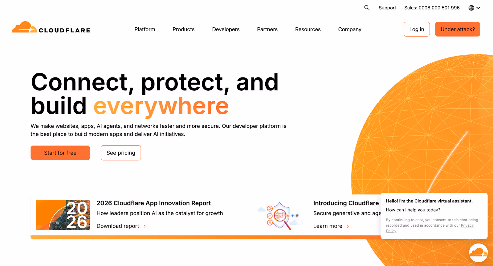
Cloudflare is a global web security and performance platform built to protect and accelerate applications, networks, and internet-facing infrastructure. Its website reflects the company’s role as foundational internet infrastructure, combining clarity, scale, and technical credibility in a highly usable experience.
From the first interaction, the site clearly communicates Cloudflare’s value across security, performance, and reliability. The messaging is structured around real-world problems protecting applications, stopping attacks, and improving speed making it easy for a wide range of users, from developers to enterprise decision-makers, to quickly understand where Cloudflare fits.
Cloudflare’s platform spans DDoS protection, web application security, zero trust networking, and edge computing services. The website introduces this breadth through clear use cases and modular sections, allowing users to explore specific solutions without feeling overwhelmed by the size of the offering.
Despite its extensive product suite, the site remains approachable through clean layouts, strong information hierarchy, and extensive educational resources. Cloudflare’s website is a strong example of how a highly technical cybersecurity platform can balance depth, usability, and trust making it a modern benchmark for security-focused websites.
Astra Pentest is a cybersecurity company that specializes in protecting businesses from hackers. The homepage is split into two parts.
On the left, you see bold text that says "Build trust in your business's security with a comprehensive, hacker-style pentest." This tells you right away that Astra Pentest can help you test your security and find any weaknesses before the bad guys do.
On the right, there's a preview of their platform dashboard, giving you a peek at how they organize and present their security findings.
The website uses a calming blue and white color scheme, which evokes a sense of trust and security. The white "Let's Talk" button stands out clearly on the blue background.
Material.security is a cybersecurity tool designed to protect your inbox from email attacks.
The homepage is split into two parts. The left side has a clear message: "Secure email from every angle." This tells you right away what Material does – it protects your email from all kinds of threats.
The right side has a simple but interesting animation graphic that shows how Material acts like a 360° shield, blocking dangerous emails before they reach you.
The website mostly uses shades of blue, a color that makes you feel calm and safe. The black "See a Demo" button stands out, making it easy to see how Material works in action.
As you scroll down, you'll see logos of famous companies like Lyft, Figma, and Postman, showing that Material is trusted by big brands to protect their email. This builds confidence in their product.
Next, there's an interactive section that looks like an email inbox. There's a red circle that, when clicked, reveals the latest cybersecurity scams you might face, like phishing scams and malware.
It's a simple way to learn about the dangers you might encounter in your inbox.
Below the interactive section, Material explains how their platform can protect you from these threats.
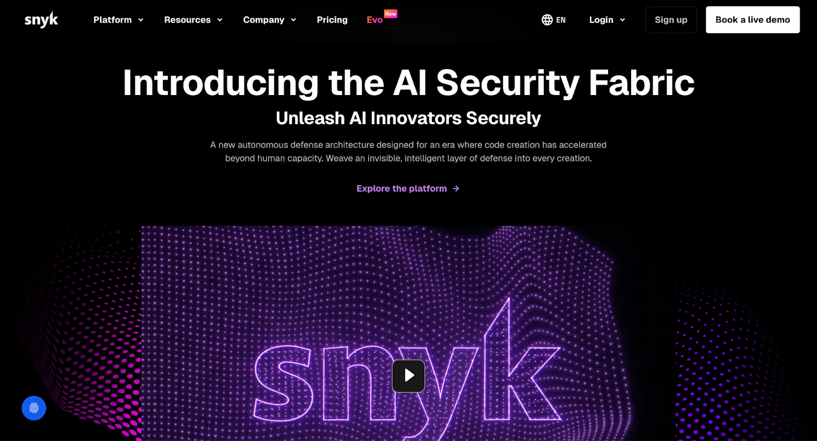
Snyk is a developer-first cybersecurity platform built to help teams identify and fix vulnerabilities early in the software development lifecycle. Its website reflects this focus clearly, positioning Snyk as a modern security solution designed for fast-moving engineering teams rather than traditional, security-only audiences.
From the first scroll, the site communicates who Snyk is for and the problems it solves. The messaging is direct and product-led, avoiding heavy jargon while still speaking to technically informed users. Clean layouts, subtle motion, and clear hierarchy help guide visitors through complex security concepts without overwhelming them.
Snyk’s platform centers on securing open-source dependencies, containers, infrastructure as code, and application code. By integrating directly with developer tools and CI/CD pipelines, it enables continuous security scanning and provides actionable remediation steps, allowing teams to fix issues as they code.
The website balances depth and clarity well. Product explanations, use-case breakdowns, and supporting visuals work together to build trust while keeping the experience intuitive. Overall, Snyk’s site is a strong example of how cybersecurity websites can educate, convert, and scale without sacrificing usability or focus.
Lacework is a company dedicated to helping businesses secure their information in the cloud while still allowing them to innovate and grow quickly.
The homepage has a split-hero section. On the left, you'll find the bold message "Time is website security's #1 adversary," highlighting the urgency of addressing enterprise security risks.
On the right, you'll see a colorful, animated logo of Lacework. This eye-catching element draws attention and adds a touch of excitement to the design. Below the logo, you'll find a list of well-known companies that trust Lacework.
As you scroll down the page, Lacework presents its key features with a focus on visual appeal. Each feature is accompanied by a relevant product photo. This makes it easy to understand how Lacework can help businesses address their website cybersecurity challenges faced.
NordLayer, a provider of flexible cybersecurity tools for businesses of all sizes. The homepage is split into two parts. On the left, it says "Stress-free way to secure your network," which tells you right away that NordLayer makes online security simple. On the right, you can see a preview of their dashboard, which looks clean and easy to use.
The website mostly uses a dark blue color, which makes you think of safety and trust. The white text is easy to read, and the buttons that say "Sign Up" and "Request a Demo" stand out, so you know where to click if you want to learn more.
Persona helps businesses securely collect, manage, and verify sensitive personal information to keep things safe and fight fraud. Their website design makes it easy for businesses to understand how they can tackle identity challenges effortlessly.
The site's design emphasizes clarity and trust. With a simple navigation bar and a focus on white space, Persona ensures that visitors can easily find what they need. The typewriter animation, while eye-catching, cleverly explains different ways Persona can help businesses.
As you scroll down, you'll see logos of popular companies that Persona has worked with, which shows that they are trusted by big brands.
Fingerprint is a powerful tool that helps businesses identify website visitors and determine their intentions, even if they're anonymous.
The homepage immediately catches your eye with a split-screen design. On the right, you get a real-time look at their visitor identification feature in action, showing your own visitor ID and details like your location and IP address. You can even toggle between visual and text modes, making the information easy to digest.
On the left, the bold headline "Identify visitors you can trust. And those you can't" briefly captures the essence of Fingerprint's purpose. Two bright orange buttons, "Start Free Trial" and "Contact Sales," stand out against the clean white background, inviting you to take action.
The website's content and graphics are top-notch. The language is clear and straightforward, while the visuals are relevant and informative.
Sonrai Security is an enterprise security platform for AWS, Azure, and Google Cloud.
The hero section features a bold headline "The First Cloud Permissions Firewall." This catchy phrase highlights that Sonrai is doing something new and different in website security. The tagline "One-Click Least Privilege. Zero Disruption" further explains how easy and efficient their solution is.
Two contrasting CTA buttons, "Start a Free Trial" and "How It Works," give you options to either try the product or learn more about it.
The website uses a clean white background with blue accents. This creates a simple and professional look that's easy on the eyes.
As you scroll down, Sonrai offers an interactive tour, so you can get a feel for how their product works without having to actually sign up.
Judy Security is a company that helps small businesses stay safe online. Their user-friendly platform simplifies password management, sign-on security, and compliance mapping.
The homepage immediately welcomes visitors with a split hero section. On the right, a vibrant group photo of smiling individuals, makes you feel like Judy Security is approachable and cares about its customers. On the left, the hero text explains the platform's focus on small and medium-sized businesses (SMBs), promising to "Safeguard Your Clients' Business with Simplicity and Strength."
The website mostly uses shades of blue and white, evoking feelings of trust, security, and professionalism. The blue CTA buttons stand out and make it easy to find where to click to learn more.
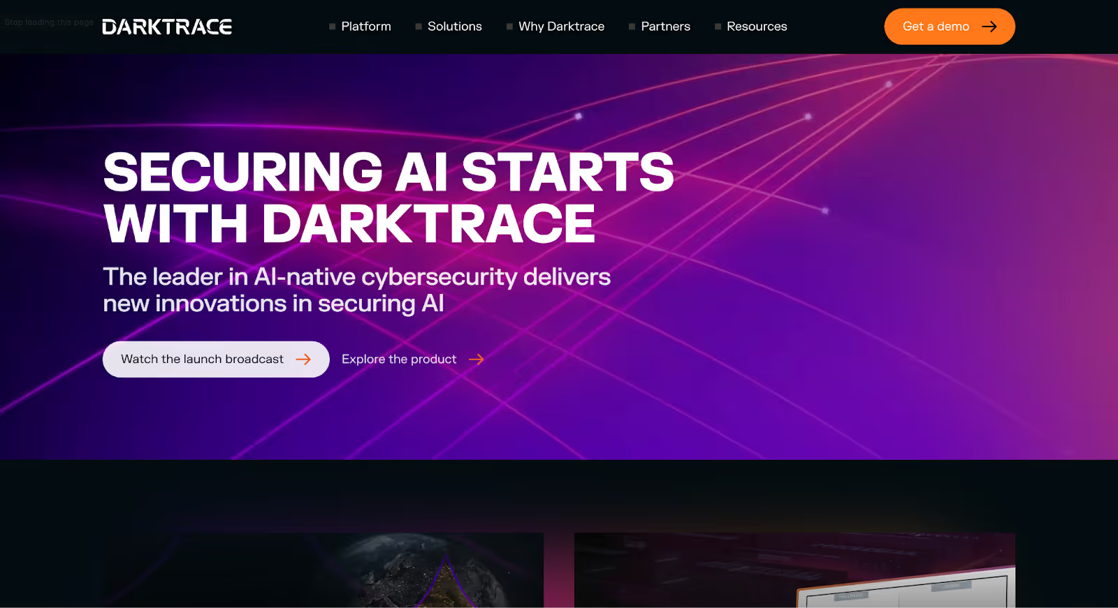
Darktrace is an AI-driven cybersecurity company focused on detecting and responding to threats across complex digital environments. Its website reflects this AI-first positioning, presenting the brand as both technically advanced and enterprise-ready without feeling overly complex.
From the first scroll, the site leans heavily into its core narrative around artificial intelligence and autonomous response. Messaging is confident and outcome-focused, helping visitors quickly understand how Darktrace identifies threats that traditional security tools often miss. Visual elements and motion are used sparingly to support the story rather than distract from it.
Darktrace’s platform covers network security, cloud environments, email, and endpoint protection, using machine learning to establish a baseline of “normal” behavior and surface anomalies in real time. The website explains these capabilities through clear use cases and layered content, making advanced AI concepts accessible to both technical and non-technical audiences.
Despite the technical depth of its offering, the site maintains clarity through structured layouts, strong visual hierarchy, and guided user journeys. Darktrace’s website is a solid example of how AI-led cybersecurity brands can communicate innovation, credibility, and scale in a way that feels modern and trustworthy.
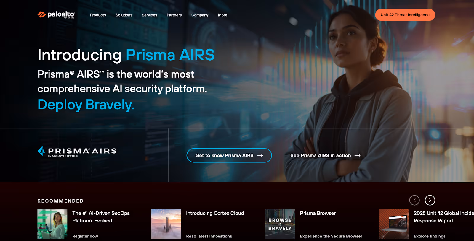
Palo Alto Networks is a global cybersecurity leader offering a broad portfolio of solutions across network security, cloud security, and security operations. Its website reflects the scale and maturity of the company while still presenting a modern, structured experience for enterprise buyers.
From the outset, the site is clearly segmented by solutions, industries, and use cases, making it easy for different audiences: CISOs, security teams, and IT leaders to find relevant information quickly. The messaging is confident and outcome-focused, emphasizing protection, visibility, and platform-driven security rather than individual tools.
The company’s offerings span next-generation firewalls, cloud-native security, zero trust, and AI-powered threat detection. Instead of diving straight into technical detail, the website introduces these capabilities through high-level narratives, gradually layering in depth for users who want to explore further.
Despite the breadth of its platform, the site maintains clarity through consistent layouts, strong visual hierarchy, and guided user journeys. Palo Alto Networks’ website demonstrates how large cybersecurity enterprises can modernize their digital presence balancing authority, trust, and usability without feeling outdated or overwhelming.
Abnormal Security is a digital security company that specializes in protecting businesses from email attacks, especially the ones that trick people into giving up their information or clicking on dangerous links.
The homepage is split into two parts. On the left, bold text says, "Go ahead, be human. Abnormal AI keeps your email protected." This reassures you that it's okay to make mistakes online because Abnormal has your back.
On the right, there's an image of a woman with a cool, scattered effect, suggesting that Abnormal can handle even the most complex and unexpected threats.
The main color is violet, which is often associated with trust and security. A light blue "See a Demo" button stands out, inviting you to see how Abnormal's technology works.
Next, the website explains the common problems that companies face with email security. Abnormal then shows you how their AI-powered platform can stop these cyber attacks before they reach you.
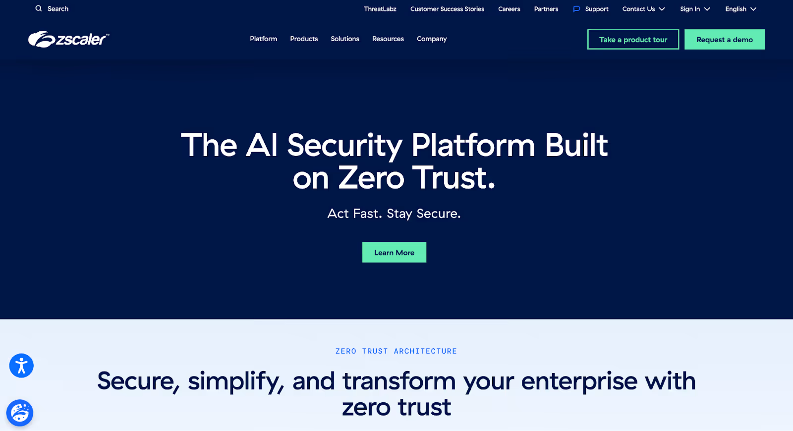
Zscaler is a cloud-native security platform best known for pioneering zero trust network access. Its website reflects this modern, cloud-first approach, positioning the company as an alternative to traditional perimeter-based security models.
From the first scroll, the site emphasizes simplicity and scale, clearly explaining how Zscaler replaces legacy VPNs and on-premise security tools. The messaging focuses on outcomes such as secure access, reduced complexity, and cloud agility, helping enterprise buyers quickly grasp the value proposition.
Zscaler’s platform secures users, applications, and data by routing traffic through its global cloud security network. The website breaks down these concepts using use-case-driven sections, diagrams, and clear explanations, making complex zero trust ideas easier to understand for both technical and business audiences.
Despite serving large enterprises, the site avoids feeling heavy or outdated. Clean layouts, consistent design patterns, and guided navigation make the experience approachable and modern. Zscaler’s website stands as a strong example of how enterprise cybersecurity brands can evolve their digital presence without losing authority or trust.
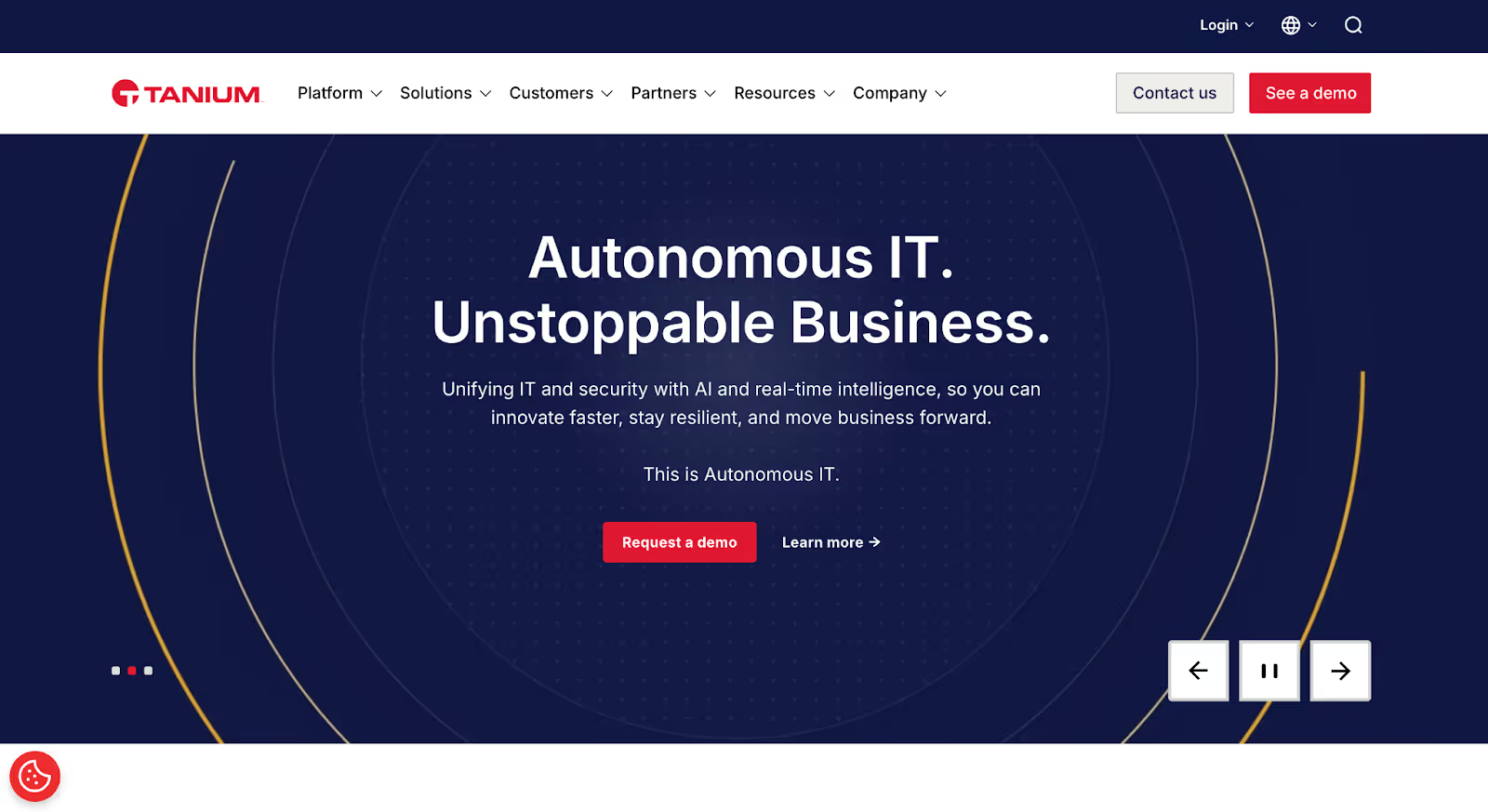
Tanium is an endpoint management and security platform designed to give organizations real-time visibility and control across their entire IT environment. Its website reflects this focus on scale, clarity, and operational confidence, positioning Tanium as a modern solution for complex enterprise infrastructures.
From the first interaction, the site emphasizes outcomes over technical noise. Messaging is structured around visibility, speed, and control, helping enterprise buyers quickly understand how Tanium fits into their security and IT operations. The layout is clean and deliberate, guiding users through high-level concepts before introducing deeper product capabilities.
Tanium’s platform combines endpoint security, asset discovery, risk management, and compliance into a single, unified system. By enabling real-time data collection across millions of endpoints, it allows security and IT teams to identify issues, respond faster, and reduce operational blind spots.
The website balances depth with usability through clear sectioning, consistent design patterns, and focused calls to action. Overall, Tanium’s site demonstrates how enterprise cybersecurity platforms can communicate complexity without sacrificing clarity making it a strong reference point for modern security website design.
Orca Security is a website security company focused on making sure your data is safe in the cloud.
Their website gets straight to the point, highlighting how much their customers love them. Right away, you see logos of companies like AWS, Carlsberg and lemonade, showing that they're trusted by industry leaders.
They then encourage you to "Get a Demo" or "Learn More," making it easy to find out how they can help you.
As you scroll down, you'll find case studies about how Orca has helped other companies solve their website security challenges.
Further down, they explain their approach to security. They do this by showing different features like access management, API Security, and Cloud Detection and Response.
Build Your Cybersecurity Website with Amply (Security Professionals Will Love It!)
For enterprise security decision-makers, a strategic approach to website design is crucial.
That's where Amply comes in. We specialize in building cybersecurity sites that not only look great but also align with your business goals. We understand the challenges you face in this industry and know how to create websites that truly connect with your target audience.
If you're ready to take the next step, let's have a chat about how we can bring your vision to life. There's no pressure here, just a friendly conversation to explore the possibilities. What do you say?
Get your Webflow SEO Google sheet checklist
Short description on the benefits or value you’ll get from using this checklist
Organizes SEO tasks for efficiency
Simplifies keyword tracking and management
Ensures consistent on-page optimization efforts
Thank you! Your submission has been received!
Oops! Something went wrong while submitting the form.
Frequently Asked questions
What makes a good cybersecurity website?
What should a cybersecurity website include?
Why is trust important in cybersecurity website design?
What are the best cybersecurity website examples?
How should a cybersecurity homepage be structured?
What design style works best for cybersecurity websites?
How can cybersecurity websites improve conversions?
What kind of content should cybersecurity websites have?
How do cybersecurity websites build credibility?
Should cybersecurity websites use technical language?
What CTAs work best on cybersecurity websites?
How can cybersecurity companies make complex products easier to understand?
Why do cybersecurity websites use dark design themes?
What should cybersecurity companies avoid on their website?
How often should a cybersecurity website be updated?
About the Author
Luke Lewis
Co-founder at Amply, has 15+ years of experience supporting and leading B2B brands like Adobe, Domo, Kizik, and many others to punch above their weight with killer B2B website design, Webflow development, and branding.

.avif)


.png)
.png)


.avif)