37 Best B2B SaaS Websites in 2025 (Plus Breakdowns)
Rajat Kapoor
March 26, 2025
12
min
Key Takeaways
Lead with a clear outcome-driven headline that says who the product is for and what it delivers.
Show the product in real context with screenshots, short demos, or an interactive tour.
Personalize messaging for roles or industries so different buyers see relevant value.
Surface trust early with logos, hard metrics, and concise case study snapshots.
Make conversion simple with obvious CTAs for demo, trial, or pricing and minimal friction.
Keep pages scannable and fast, and include resources like docs and FAQs to support decisions.
Introduction
A great B2B SaaS website does more than look good—it clearly explains what the product does, builds trust, and drives action. But not all websites get this right.
We analyzed over 100 SaaS websites and narrowed it down to the 37 best B2B SaaS websites for 2025. These are the sites that stand out—not just in design, but in how they communicate value and convert visitors into customers. This guide breaks down the key elements that make them work, from clear messaging to smart design and conversion-focused strategies.
Whether you're refining your site or starting fresh, you’ll find practical takeaways to apply right away.
A well-designed B2B SaaS website isn’t just about looking professional—it needs to communicate value, build trust, and drive action. The best websites get a few key things right:
1. Clear Messaging That Gets to the Point
Visitors should instantly understand what the product does and why it matters. A strong headline, a short supporting sentence, and a clear call-to-action (CTA) can make all the difference.
A great SaaS homepage avoids vague statements like “Revolutionizing the future of business” and instead says something specific, like “Automated security monitoring to help you get compliant faster.”
2. A Homepage That Shows, Not Just Tells
People don’t want to scroll through paragraphs of text to understand a product. The best SaaS websites use:
Product visuals (GIFs, screenshots, or short videos)
Concise explanations (no jargon, just clarity)
Social proof (logos, testimonials, or case studies)
Instead of describing every feature in detail, great websites visually demonstrate how the product works in action.
3. Frictionless Navigation
If visitors can’t find what they need fast, they’ll leave. A great SaaS website keeps navigation simple and predictable by:
B2B buyers don’t make decisions lightly—they need proof that your product works. The best websites build trust by including:
Customer logos (well-known brands using the product)
Case studies & testimonials (real-world success stories)
Security certifications & compliance badges
Even something as small as a “Trusted by 5,000+ companies” badge can make a difference in how credible your business appears.
5. Personalized Visitor Experience
A great SaaS website feels like it was made for each visitor, showing relevant messaging, case studies, and CTAs based on their industry, role, or company size. The best personalized sites:
Segment visitors into clear personas (e.g., “For Marketing Teams,” “For IT Leaders”)
Dynamically adjust content (headlines, testimonials, images) to match each persona
Use smart CTAs that speak directly to a visitor’s needs (“See Marketing Dashboard,” “Book IT Security Review”) Personalization can substantially boost engagement and conversions. Learn how leading sites do it with our 6 Powerful B2B Website Personalization Examples in 2025 article.
6. Calls-to-Action That Make the Next Step Obvious
A great SaaS website guides visitors to take action—whether that’s starting a free trial, booking a demo, or signing up. The best CTAs are:
Easy to find (high-contrast buttons in key places)
Action-driven ("Start Free Trial" is clearer than "Learn More")
Consistent (the same CTA repeated across the page)
If visitors have to think too hard about what to do next, they’ll likely leave without taking action.
Want to improve your website conversions? Check out the SaaS website conversion checklist we've used to audit and improve dozens of SaaS websites.
67. Fast Load Times & Mobile Optimization
Even the best-designed website won’t convert if it’s slow or hard to use on mobile. Great SaaS websites:
Load in under three seconds
Work seamlessly on all devices
Keep forms and buttons easy to tap on mobile
A slow or clunky website leads to lost conversions, no matter how great the product is.
A strong SaaS website is about making it effortless for visitors to understand, trust, and take action. Next, we’ll look at the top B2B SaaS websites and break down exactly what makes them stand out.
37+ Best B2B SaaS Websites in 2025 (Ranked & Reviewed)
Not all SaaS websites are created equal. Some look great but fail to convert, while others might not be the flashiest but do an excellent job of guiding visitors toward action. The best ones strike the right balance between clarity, usability, and trust-building—making it easy for potential customers to understand what the product does and why they should care.
Let’s look at each of them one by one. We’ll cover what each product does, and why their website works for them well.
1. Chili Piper
Chili Piper is a demand conversion platform that helps businesses route, qualify, and schedule meetings instantly—turning leads into sales pipeline faster.
Why it works:
Clear, outcome-driven messaging – The homepage headline says:
"Finally, a single platform for converting all demand into pipeline."
It focuses on what matters most to their audience—results, not just features.
Visual storytelling with product UI – Instead of long descriptions, Chili Piper shows how the product works with interactive UI previews, making it easy for visitors to understand.
Trust-building elements early on – Logos from top brands (Gong, Shopify, Twilio, Airbnb) establish credibility right away, reinforcing that well-known companies trust their product.
Takeaway:
Chili Piper’s website is built to convert—by keeping messaging clear, using real product visuals, and minimizing friction in the user journey.
2. Vanta
Vanta helps businesses automate security compliance (SOC 2, ISO 27001, HIPAA) by continuously monitoring security risks.
Why it works:
Direct and urgent messaging – The headline "Automate your security monitoring to get compliant and stay secure." tells visitors exactly what Vanta does and why it matters.
Visual storytelling – Instead of long explanations, the homepage uses visuals and short, digestible text to show how the product works.
Credibility through compliance badges – Vanta showcases security certifications and customer logos, immediately building trust with prospects.
Takeaway:
Vanta makes a technical, compliance-heavy product easy to understand with clear copy, strategic visuals, and strong trust signals.
3. Lattice
Lattice is an HR platform that helps companies build high-performing teams by improving performance management, employee engagement, and operational efficiency.
Why it works:
Clear and people-first messaging – The homepage headline, “The HR platform people love,” emphasizes employee experience and workplace impact, rather than just HR software features.
AI-powered differentiation – Lattice positions itself as more than a typical HR tool, stating that their AI-powered platform helps HR teams and leaders make better, data-driven decisions.
Focus on productivity, not just HR tasks – The messaging shifts from just HR processes to business impact, using statements like “Less paperwork, more people work.”
Strong social proof – Logos from companies like Slack, Reddit, and NPR build credibility, while real employee testimonials humanize the platform.
Seamless integrations – The homepage highlights compatibility with popular workplace tools like Google, Slack, and Workday, making it clear that Lattice fits into existing workflows.
Takeaway:
Lattice’s homepage stands out because it’s not just about HR tools—it’s about helping teams perform better. The messaging is human-centered, data-driven, and focused on business impact, making it easy for decision-makers to see why it matters.
4. Surfer
Surfer is an AI-powered content optimization tool that helps SEOs, agencies, and content teams create high-ranking content using data-driven insights.
Why it works:
Strong, results-driven messaging – The headline "The Best-Performing Content is Made with Surfer" speaks directly to the goal of content marketers: higher rankings.
Instant credibility – Mentions 70,000+ users, including agencies and SEOs, to reinforce trust.
Live product visuals – Shows how Surfer’s SEO scoring and recommendations work in real-time, making it easy to grasp the value.
Frictionless conversion – The 7-day money-back guarantee reduces hesitation and encourages trial.
Takeaway:
Surfer’s homepage is clear, data-backed, and conversion-focused, making it easy for SEOs to see how it improves rankings.
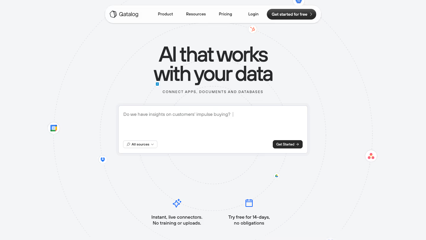
5. Qatalog
Qatalog is an AI-powered knowledge management platform that connects apps, documents, and databases in one place, helping businesses find and access information effortlessly.
Why it works:
Simple, direct messaging – The headline "AI that works with your data" clearly explains the product's core function.
Minimalist and futuristic design – The clean, structured layout makes the product feel modern, intelligent, and easy to use.
Frictionless conversion – A **“**Get started for free” CTA encourages quick signups with no technical expertise required.
Enterprise-ready trust signals – GDPR compliance, SOC 2 certification, and Gartner recognition help build credibility.
Takeaway:
Qatalog’s homepage is clean, intuitive, and trust-focused, making it easy for businesses to understand and adopt its AI-powered knowledge management system.
6. Gainsight
Gainsight is a customer success platform that helps businesses reduce churn, improve retention, and enhance customer experiences using AI-powered insights and automation.
Why it works:
Memorable, benefit-driven messaging – "Lower Churn 😎, Lower Burn 🔥" makes it clear, catchy, and focused on real business impact.
Human + AI positioning – Gainsight emphasizes "Human-First AI," balancing automation with personalized customer engagement.
Trust-building elements – Recognized by Gartner, with social proof from companies like Notion, ZenDesk, and Falcon.io.
Action-focused CTAs – “Get a Demo” and “Schedule Your Personalized Demo” appear frequently, making it easy for prospects to take the next step.
Takeaway:
Gainsight’s homepage is engaging, trust-driven, and outcome-focused, making a strong case for AI-powered customer success while keeping human relationships at the core.
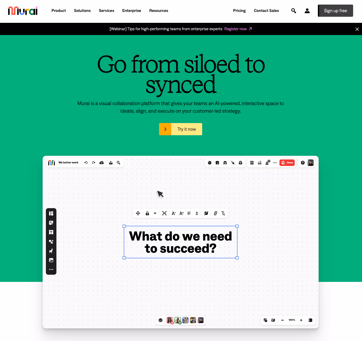
7. Mural
Mural is a visual collaboration platform that helps teams ideate, align, and execute on customer-led strategies using AI-powered, interactive workspaces.
Why it works:
Strong transformation messaging – "Take go-to-market teams from siloed to synced" clearly explains how Mural solves team misalignment.
Live product visualization – The homepage shows the platform in action, making it easy to grasp how it works.
Enterprise credibility – Trusted by Microsoft, IBM, Intuit, and Atlassian, reinforcing security and reliability.
Engaging, interactive CTAs – “Try it now” removes friction, making it clear that users can start immediately.
Takeaway:
Mural’s homepage is bold, interactive, and enterprise-focused, making a strong case for AI-powered collaboration in modern teams.
8. Gusto
Gusto is an all-in-one payroll, HR, and benefits platform designed to help small businesses pay employees, manage benefits, and handle compliance with ease.
Why it works:
Clear and simple messaging – "Payroll, HR, benefits. Simplified." instantly tells visitors what Gusto does in just a few words.
Strong social proof – Features high ratings from TechRepublic, Trustpilot, and PCMag, reinforcing trust.
Real customer success stories – Testimonials highlight how Gusto saves businesses time on payroll and HR.
Frictionless conversion – CTAs like "Get Started" and transparent pricing make it easy for users to take action.
Takeaway:
Gusto’s homepage is clear, trust-driven, and small-business-friendly, making HR and payroll feel approachable and hassle-free.
9. Loom
Loom is an async video messaging tool that helps teams communicate faster and more effectively through quick screen recordings with voiceovers.
Why it works:
Clear value-driven messaging – "One video is worth a thousand words." Immediately conveys the benefit of faster, more efficient communication.
Strong social proof – Used by 28M+ people across 490,000+ companies, including Tesla, HubSpot, and Disney.
Beyond just screen recording – Highlights features like AI-powered transcriptions, engagement analytics, and video security to show added value.
Frictionless onboarding – CTAs like "Sign up free" remove barriers for new users to try it instantly.
Takeaway:
Loom’s homepage is simple, engaging, and action-driven, making async video messaging feel essential for modern teams.
10. LinkSquares
LinkSquares is an AI-powered legal technology platform that helps businesses manage contracts, automate workflows, and streamline legal operations.
Why it works:
Clear positioning – "All-in-one legal technology, powered by AI." Instantly communicates that it’s a comprehensive legal tech solution.
Strong credibility signals – Trusted by 1,000+ companies, with logos from TIME, Wayfair, and Prudential reinforcing authority.
Focus on efficiency & automation – Highlights faster contract processing, AI-powered insights, and seamless integrations to save legal teams time.
LinkSquares’ homepage is trust-driven and efficiency-focused, making a strong case for AI-powered legal automation.
11. Leapsome
Leapsome is an AI-powered people management platform that helps businesses improve performance, engagement, and HR operations through automation and analytics.
Why it works:
People-first messaging – "The HR platform your people will actually use." Positions Leapsome as engaging and user-friendly, not just another HR tool.
Strong social proof – Trusted by brands like Bolt, Workato, and Unity, reinforcing credibility.
Clear benefits & automation focus – Showcases AI-powered reviews, seamless HR automation, and engagement tracking to help companies retain top talent.
Seamless integrations – Works with Slack, Jira, Personio, and other workplace tools, ensuring easy adoption.
Takeaway:
Leapsome’s homepage is human-centric, automation-driven, and integration-friendly, making HR smarter and more impactful for growing teams.
12. Paperform
Paperform is a versatile form builder that allows businesses to create beautiful, interactive forms, surveys, and booking pages with advanced customization and automation.
Why it works:
Clear and action-driven messaging – "Create powerful forms, fast." Instantly conveys ease of use and speed.
Beyond just forms – Highlights use cases like scheduling, proposals, and payments, making it more than a typical form builder.
Seamless integrations – Works with tools like Google Sheets, Stripe, and Zapier, making automation easy.
Strong social proof – Over 730,000 forms built, backed by testimonials and enterprise logos.
Takeaway:
Paperform’s homepage is conversion-focused and feature-rich, showing businesses how forms can do more than just collect data—they can streamline operations.
13. Softr
Softr is a no-code platform that lets businesses build custom apps, portals, and internal tools using Airtable or Google Sheets as a database.
Why it works:
Strong, benefit-driven headline – “Build custom apps for your business, fast.” The messaging is direct, simple, and focused on speed, which appeals to non-technical users looking for quick solutions.
Interactive product preview – The homepage features a live demo where users can interact with the platform, helping them understand its capabilities without signing up.
Pre-built templates for quick adoption – Instead of overwhelming users with endless possibilities, the homepage highlights ready-to-use templates, showing how Softr can be applied to real use cases.
Customer proof and trust-building – The homepage showcases trusted brands and user testimonials, making it easier for businesses to trust the platform for their needs.
Takeaway:
Softr’s homepage reduces friction by making the product instantly understandable, using interactive previews, templates, and customer validation to guide visitors toward trying the platform.
14. Gong
Gong is an AI-powered revenue intelligence platform that helps sales teams analyze customer interactions, improve forecasting, and drive pipeline growth.
Why it works:
Bold and outcome-driven messaging – "A better way to revenue." Speaks directly to revenue teams looking for efficiency.
AI-powered differentiation – Highlights revenue AI for forecasting, deal insights, and customer interactions, making it clear how Gong adds value.
Strong social proof – Trusted by 4000+ companies, including Nasdaq, LinkedIn, and Dropbox.
Role-based benefits – Breaks down how different teams (Sales, RevOps, Customer Success) benefit from Gong, making adoption easier.
Takeaway:
Gong’s homepage is bold, high-impact, and AI-focused, positioning it as an essential tool for revenue teams to drive predictable growth.
15. Slack
Slack is a business communication platform that brings people, projects, apps, and AI together in a single workspace for faster, more efficient collaboration.
Why it works:
Clear, relatable messaging – "Where work happens." Positions Slack as the go-to workspace for teams.
AI-powered collaboration – Emphasizes AI-driven messaging, integrations, and automation to streamline workflows.
Massive social proof – Used by 700M+ messages sent daily and companies like Uber, Airbnb, and IBM.
Flexible for any team – Offers pricing plans for different business sizes, making it accessible for startups to enterprises.
Takeaway:
Slack’s homepage is simple, AI-driven, and business-focused, reinforcing it as an essential tool for modern work and collaboration.
16. Notion
Notion is an all-in-one workspace that combines notes, docs, project management, and databases into a single, customizable platform.
Why it works:
Minimalist yet effective design – The homepage has a clean, distraction-free layout with ample white space, making it easy for visitors to absorb key information.
Strong product visualization – Rather than lengthy explanations, Notion uses high-quality product screenshots to showcase its flexibility and real-world use cases.
Emphasizes adaptability – The homepage highlights how Notion can be customized for teams and individuals, making it clear that the tool works for multiple use cases.
Sticky CTAs & guided entry points – Whether a visitor is new to Notion or already familiar, the homepage offers clear pathways for different user needs (e.g., templates, AI, team collaboration).
Takeaway:
Notion’s homepage works because it mirrors the product itself—simple, flexible, and intuitive. It eliminates fluff and gets straight to showing how Notion adapts to different workflows, making it easy for users to see its value.
17. Miro
Miro is a collaborative online whiteboard platform designed for teams to brainstorm, plan, and execute projects visually.
Why it works:
Strong narrative flow – The homepage leads visitors through Miro’s value step by step, from ideation to execution, making it clear how the tool fits into a workflow.
High engagement visuals – Instead of long blocks of text, Miro relies on interactive graphics, GIFs, and motion elements to show how the product works in action.
Clear CTAs at every stage – Whether visitors are exploring features, use cases, or integrations, Miro consistently nudges them to sign up or start a free trial.
Social proof & credibility – The homepage prominently displays customer testimonials, case studies, and enterprise trust signals, reinforcing Miro as a go-to solution for collaboration.
Takeaway:
Miro’s homepage does a great job of guiding potential customers through the product’s benefits, visually demonstrating its ease of use, and strategically placing CTAs to encourage sign-ups.
18. monday.com
Monday.com is a work management platform that helps teams collaborate, plan, and automate workflows across various departments.
Why it works:
Clear audience segmentation – The homepage immediately breaks down solutions for different teams (Marketing, Sales, CRM, IT, etc.), making it easy for visitors to find relevant use cases.
Visual hierarchy guides the user journey – The homepage sections follow a structured flow, introducing the product, its core benefits, and social proof before leading into CTAs.
High-contrast CTA placement – CTAs like "Try for free" are highly visible and repeated throughout the page, making it easy for visitors to take action at any point.
Trust signals upfront – The homepage highlights Fortune 500 companies that use Monday.com, reinforcing credibility and reducing friction for potential buyers.
Takeaway:
Monday.com’s homepage efficiently guides different types of users toward relevant solutions, builds trust with social proof, and maintains a clean, conversion-focused design. It makes it easy for visitors to understand the platform and take action quickly.
19. Asana
Asana is a work management platform that helps teams collaborate, manage tasks, and streamline workflows across different departments.
Why it works:
Clear, action-oriented headline – "Where work connects." This instantly communicates Asana’s core value of collaboration without unnecessary fluff.
Real-world use cases front and center – Instead of just listing features, the homepage shows how Asana is used by different departments, making it easier for prospects to visualize its benefits.
Social proof and credibility – The homepage highlights that 85% of Fortune 100 companies use Asana, reinforcing its reliability for enterprise teams.
Strong focus on integrations – By showcasing 300+ integrations, Asana reassures businesses that it fits seamlessly into their existing workflows.
Takeaway:
Asana’s homepage works because it immediately connects with its audience by focusing on collaboration, credibility, and real-world use cases, making the platform’s value easy to grasp.
20. Typeform
Typeform is an interactive form and survey builder designed to create engaging, user-friendly data collection experiences that feel more like conversations than traditional forms.
Why it works:
Strong emotional hook in the headline – “Get to know your customers with forms worth filling out.” This directly addresses a pain point—most online forms feel tedious, while Typeform makes them more engaging.
Visual storytelling through design – The homepage uses colorful, high-contrast sections, engaging animations, and product visuals to make it clear how Typeform works without long explanations.
User-centric benefit statements – Instead of listing features, Typeform focuses on what users gain: “3.5x more data”, “better insights”, and “forms designed to attract responses”—all framed around outcomes, not technical specs.
Social proof and integrations – The site highlights trusted brands like Airbnb and Notion, plus hundreds of integrations, reinforcing credibility and ease of use.
Takeaway:
Typeform’s homepage works because it prioritizes engagement—both in its messaging and design. It makes data collection feel conversational, visually appealing, and easy to understand, setting it apart from traditional form builders.
21. Intercom
Intercom is an AI-powered customer service platform that combines chatbots, automation, and human support to help businesses provide fast, scalable customer assistance.
Why it works:
Bold, differentiating headline – “The best AI Agent and AI-first Customer Service Platform” immediately sets the tone, positioning Intercom as a category leader. Instead of generic claims, they own the AI-first positioning in customer service.
Compelling use of visual storytelling – The homepage blends hand-drawn illustrations, real-world UI elements, and product screenshots to demonstrate how AI fits into customer conversations. This makes the offering feel both high-tech and approachable.
Strategic use of social proof – Featuring well-known brand logos and testimonials establishes trust. Instead of just listing logos, Intercom incorporates real customer experiences and stats to back up their claims.
Outcome-driven messaging – The homepage doesn’t just describe features; it emphasizes business impact: “Reduce costs, boost efficiency, and improve customer experience.” This keeps the focus on what matters most to prospects.
Takeaway:
Intercom’s homepage works because it blends strong positioning, engaging visuals, and trust-building elements to make their AI-powered customer support platform feel essential, innovative, and easy to adopt.
22. Zendesk
Zendesk is an AI-powered customer service platform designed to help businesses streamline support, reduce response times, and enhance customer interactions while keeping a human-first approach.
Why it works:
Clear, human-centric positioning – The homepage headline, “AI-first service. Catered to humans.” sets Zendesk apart by balancing automation with a human touch. It reassures businesses that AI won’t replace support teams—it will enhance them.
Engaging product walkthrough – Instead of static visuals, the homepage features an interactive product tour, letting users experience Zendesk’s interface before signing up. This reduces friction in the decision-making process.
Trust-building elements – Logos from well-known companies, testimonials, and industry ****awards are integrated throughout the page, reinforcing credibility without overwhelming visitors.
Benefit-driven storytelling – Instead of listing features, Zendesk frames them around customer outcomes, such as "Improve efficiency," "Reduce costs," and "Increase personalization." This keeps the focus on real business impact.
Takeaway:
Zendesk’s homepage is effective because it combines human-first messaging, interactive elements, and trust signals to create a compelling, low-friction introduction to its AI-powered support platform.
23. Zoom
Zoom is a video conferencing and AI-powered collaboration platform that helps businesses streamline communication, enhance productivity, and integrate AI-driven features for better workflows.
Why it works:
Strong headline positioning – "Transform your information into action with AI Companion" instantly conveys Zoom’s shift from just video conferencing to a broader AI-powered work platform. This keeps them relevant as the industry evolves.
Clear product differentiation – The homepage immediately highlights AI Companion as a built-in feature, addressing a key concern for businesses looking for automation without extra costs.
Social proof and credibility – Logos from major companies like Nasdaq, Fortune, and Walmart reinforce Zoom’s authority in the enterprise space. The homepage also showcases real-world stories to back up its claims.
Engaging content structure – The design breaks down information into bite-sized sections, avoiding information overload while keeping users engaged. Key offerings like education, healthcare, and financial services solutions are presented visually for easy navigation.
Takeaway:
Zoom’s homepage effectively communicates its AI-driven evolution while maintaining clarity, credibility, and an easy-to-digest structure. It reassures users that Zoom isn’t just for meetings—it’s a full-fledged work platform.
24. Atlassian
Atlassian provides collaboration and productivity software, including Jira and Confluence, designed for teams to plan, track, and manage work efficiently.
Why it works:
Hero section that balances branding and product introduction – The homepage immediately introduces "The new Jira: from teams to dreams," aligning with its mission while maintaining a fresh, aspirational approach.
Strategic use of white space and clean layout – The design avoids overwhelming users, instead using a structured flow that gradually introduces features and benefits while maintaining visual clarity.
Social proof backed by real-world stats – Large numbers like 185,916+ teams using Atlassian globally make a compelling case for credibility, reinforcing trust with potential users.
Seamless integration of AI messaging – The homepage introduces AI collaboration naturally, showing how the platform adapts to modern team needs rather than forcing AI as a buzzword.
Takeaway:
Atlassian's homepage excels in structured storytelling, clean UI, and credibility-building. By blending brand messaging with clear product benefits, it guides users naturally toward learning more or signing up
25. Stripe
Stripe provides a financial infrastructure that enables businesses to process online payments, manage revenue, and expand globally with integrated banking and financial tools.
Why it works:
Minimalist yet authoritative design – Stripe's homepage uses white space, subtle gradients, and sharp typography to project an image of sophistication and reliability, making it feel premium and enterprise-grade.
Strong messaging with a financial focus – The hero section, “Financial infrastructure to grow your revenue,” makes it clear who Stripe serves (businesses) and what it helps them achieve (growth).
Developer-first approach – Code snippets are embedded directly into the homepage, reinforcing Stripe's technical credibility and showing how easy integration is for engineers.
Trust signals through customer logos and enterprise partnerships – Featuring names like Amazon, Shopify, and Ford, Stripe builds instant credibility, proving its infrastructure supports some of the world's biggest brands.
Takeaway:
Stripe’s homepage effectively speaks to both developers and business leaders by blending technical depth with high-level business benefits. The refined visual identity and structured content position it as the go-to financial backbone for modern businesses.
26. Webflow
Webflow is a website experience platform that allows designers, marketers, and developers to build, manage, and scale websites without needing to write code.
Why it works:
Bold, confidence-driven messaging – The hero section, **“**Your site should do more than look good,” positions Webflow as more than just a design tool—it’s a business growth enabler. This instantly differentiates it from traditional website builders.
High-contrast, premium visual identity – The dark, high-contrast UI gives Webflow’s homepage a sleek, professional feel, reinforcing its positioning as a high-end, serious tool for professionals.
Interactive previews of the platform – Instead of just describing what it does, Webflow shows the product in action, making it easy for visitors to see its value without needing to leave the page.
Social proof through major brands – The site highlights well-known companies that trust Webflow (like Dell, Rakuten, and TED), instantly reinforcing credibility and enterprise suitability.
Takeaway:
Webflow’s homepage uses bold design, interactive product previews, and authority-building elements to position itself as the serious choice for professionals who want more control over their websites. It effectivelymoves beyond the “no-code builder” label and establishes itself as a business-driving tool.
27. Segment (Twilio)
Segment is a customer data platform (CDP) that helps businesses collect, clean, and unify customer data to enable personalized marketing and AI-driven customer interactions.
Why it works:
Clear positioning with an AI-driven edge – The homepage headline, “The leading customer data platform, powered by AI”, immediately tells visitors what Segment does and why it’s different, leveraging the AI trend for credibility.
Strong visual hierarchy for data-driven credibility – Statistics like 12.1 trillion API calls processed in 2023 and 400M+ in sales driven act as social proof, showing Segment’s scale and impact in a way that builds trust.
Seamless integrations as a competitive advantage – The site highlights 450+ integrations, displayed in a grid of instantly recognizable logos, reinforcing how easily Segment fits into existing workflows.
Case studies and industry validation – The homepage showcases big-name brands like IBM, Sanofi, and Domino’s, reinforcing its credibility among enterprise users.
Takeaway:
Twilio Segment’s homepage works because it combines clear AI positioning, credibility-building stats, seamless integrations, and social proof. It effectively communicates that Segment is a trusted, scalable choice for customer data management, catering to both marketers and data teams.
28. Twilio
Twilio is a customer engagement platform that provides APIs for messaging, voice, and video communication, helping businesses personalize customer interactions at scale.
Why it works:
Strong social proof from the start – The homepage opens with Gartner’s recognition of Twilio as a leader, immediately establishing credibility and trust.
Clear product positioning with modular cards – Twilio’s four core product offerings (User authentication, Voice APIs, Messaging platform, Twilio Flex) are presented in distinct cards, making it easy to scan and understand.
Developer-first approach with interactive elements – The "Send your first text message" section features live code snippets, reinforcing Twilio’s appeal to developers while also offering no-code alternatives.
Customer success stories and brand validation – The site showcases Shopify’s case study and enterprise clients like Toyota, IBM, and Airbnb, strengthening Twilio’s credibility in the B2B space.
Takeaway:
Twilio’s homepage works because it combines strong industry validation, a clear modular layout, interactive developer-friendly elements, and enterprise social proof. It speaks to both developers and business users, making the case for why Twilio is the go-to choice for scalable customer engagement solutions.
29. Maze
Maze is a rapid user testing and research platform that helps product teams recruit participants, run surveys, and analyze user insights to make data-driven design decisions.
Why it works:
Straight-to-the-point messaging – The hero section’s **"**Don't choose between building fast and building right" immediately positions Maze as a solution for speed and accuracy, addressing a key concern for product teams.
Strong visual storytelling – The homepage uses interactive UI mockups to demonstrate how Maze works, making it easier for users to visualize the product in action.
Clear differentiation – Maze highlights how it simplifies recruiting, research, and analysis, reinforcing the platform’s end-to-end usability testing capabilities.
Trust signals from well-known brands – Companies like Hertz, Hitachi, and top names in UX are prominently featured, adding credibility.
Consistent CTA placement – "Try it free" and "See Maze in action" buttons are placed at key decision points, making it easy for users to convert.
Takeaway:
Maze’s homepage works because it’s structured to build trust quickly, visually demonstrate the product, and drive sign-ups with well-placed CTAs.
30. Chargebee
Chargebee is a subscription management and billing platform that helps businesses automate recurring payments, revenue operations, and customer retention strategies.
Why it works:
Directly addresses a business pain point in the hero section – "Unlock a lifetime of subscriber growth and retention" appeals to companies looking to increase revenue and reduce churn.
Strong credibility signals – Logos of trusted companies (Typeform, Freshworks, Toyota) are displayed early, reinforcing social proof.
Clear and structured product breakdown – Chargebee's features are split into Products and Solutions, making it easy for users to find what they need.
Smart use of testimonials and case studies – The Pret case study is integrated into the homepage, showing real-world success stories and making the solution feel more actionable.
Conversion-focused CTAs – The repeated "Get a Demo" and "Let’s Talk" buttons ensure visitors always have an easy way to engage.
Takeaway:
Chargebee's homepage effectively balances trust-building, feature explanation, and conversion optimization, making it a strong performer in the subscription billing space.
31. Amplitude
Amplitude is a digital analytics platform that helps businesses track user behaviour, measure engagement, and optimize product experiences using data-driven insights.
Why it works:
Strong headline with a clear value proposition – “Chart Your Path to Growth with Digital Analytics” immediately tells visitors what Amplitude does and how it helps businesses grow.
Live product demonstrations – The homepage features interactive analytics dashboards, allowing users to see the product in action without needing to sign up first.
Data-backed credibility – Amplitude showcases trusted brands like Zoom, Atlassian, and Amway, reinforcing its authority in the analytics space.
Seamless flow from features to benefits – The site guides visitors through why data matters, how Amplitude works, and how it improves decision-making, creating a natural conversion journey.
Strong social proof – Case studies, customer testimonials, and industry recognition from G2 and Gartner help establish trust.Takeaway:
Amplitude’s homepage is structured to educate, engage, and convert users by demonstrating value through real-world use cases, interactive product visuals, and strong credibility markers.
32. Snyk
Snyk is a developer-first security platform that helps teams find and fix vulnerabilities in code, open-source dependencies, containers, and cloud infrastructure.
Why it works:
Bold and direct hero section – “Develop Fast. Stay Secure.” is a simple yet powerful tagline that speaks directly to developers who prioritize both speed and security.
Immediate credibility boost – Showcasing logos of trusted brands like Google, Atlassian, and Revolut establishes authority and trust.
Clear value proposition – The homepage clearly breaks down Snyk’s core functionalities: integrate easily, scan continuously, and fix with a click, making it easy for visitors to grasp the benefits.
Visually engaging and modern design – The combination of futuristic gradients, AI imagery, and interactive elements aligns with its cutting-edge security positioning.
Seamless navigation and conversion paths – Multiple CTAs (“Book a live demo,” “Learn more”) guide users toward engaging with the product without overwhelming them.
Customer success stories for proof – Featuring case studies from Komatsu, Snowflake, and Spotify highlights how real-world companies benefit from Snyk.
Takeaway:
Snyk’s homepage is laser-focused on developers with a clear, engaging, and credibility-driven approach that makes security feel accessible, fast, and easy to implement.
33. Figma (Teams & Enterprise)
Figma (Teams & Enterprise) is a web-based collaborative design tool that helps teams create, prototype, and ship high-quality digital products.
Why it works:
Minimalist, High-Impact Design – The homepage uses clean layouts, bold typography, and bright color blocks, reinforcing its modern and innovative brand identity.
Strong Social Proof – Immediately highlights trusted brands like Zoom, Microsoft, and Kimberly-Clark, positioning itself as an enterprise-ready solution.
Clear and Purposeful Messaging – The copy focuses on breaking down silos, improving agility, and securing data, speaking directly to enterprise needs.
Feature Breakdown with Visuals – Each section (Collaboration, Scalability, Security, Integrations) is visually distinct and easy to digest, making it effortless to scan.
Takeaway:
Figma’s homepage is streamlined, visually engaging, and focused on enterprise efficiency, making it an effective tool for converting larger teams looking for a scalable and secure design collaboration platform.
34. Fivetran
Fivetran is a data movement platform that automates data integration, ensuring businesses can seamlessly move data from any source to any destination.
Why it works:
Strong Hero Messaging – The headline **“**Moving data. Powering innovation.” immediately conveys the value proposition in a clear, succinct way.
Deployment Flexibility is Front and Center – The Cloud, Hybrid, and On-Prem deployment model section ensures enterprise customers see Fivetran as a scalable, flexible solution.
Security as a Key Selling Point – A dedicated security compliance section highlights ISO, PCI, and HITRUST certifications, which is crucial for enterprise adoption.
Data-Driven Proof Points – Metrics like “400% ROI” and “99.9% uptime” immediately build confidence in the reliability and efficiency of the platform.
Takeaway:
Fivetran’s homepage is structured strategically, guiding enterprise buyers from awareness to trust, to exploration and action in a logical and visually engaging manner.
35. Linear
Linear is a modern issue-tracking and project management tool designed for high-performance product teams, offering a fast, minimal, and efficient way to plan, track, and manage software development.
Why it works:
Minimalist and High-Performance Aesthetic – Linear's homepage is dark-themed, sleek, and highly visual, which immediately sets the tone for its high-performance, developer-first approach.
Instant Clarity in Positioning – The hero section clearly states:“Linear is a purpose-built tool for planning and building products.”This concise messaging tells visitors exactly what the tool is and who it's for.
Developer-Friendly Appeal – With mentions of API integrations and a command-line interface, the website speaks directly to engineers and technical teams who value performance and automation.
Takeaway:
Linear’s homepage reflects its product philosophy: fast, distraction-free, and designed for execution. It builds immediate trust with its audience—developers, product managers, and designers who value speed and clarity.
36. Better Stack
Better Stack provides a high-performance observability platform designed to monitor uptime, manage logs, handle incidents, and track infrastructure health in real time.
Why it works:
High-Impact Hero Section – The bold headline "Radically better observability stack" instantly communicates differentiation and product superiority, appealing to DevOps teams and engineers.
Product UI is the Focus – Instead of stock images or abstract illustrations, Better Stack directly showcases its interface in a clean, no-nonsense layout that lets the product speak for itself.
Live Data Visuals Create a Sense of Action – The homepage uses realistic-looking charts, logs, and dashboards, reinforcing the platform’s real-time monitoring capabilities.
Concise, Developer-Friendly Copywriting – Instead of lengthy explanations, the homepage keeps descriptions minimal and technical, respecting the time and expertise of DevOps professionals.
Takeaway:
Better Stack’s homepage works because it looks and feels like the product it offers—fast, sleek, and built for performance-driven teams. It avoids unnecessary fluff and gets straight to what matters most for its audience: reliability, speed, and clarity.
37. Bloomreach
Bloomreach offers an AI-powered eCommerce personalization platform that combines marketing automation, product discovery, and customer data to create tailored shopping experiences.
Why it works:
Strong, Clear Hero Message – The homepage immediately communicates Bloomreach’s core offering: AI-driven eCommerce personalization. The supporting text concisely explains what the platform does and its benefits.
Engaging Visuals That Reinforce AI Personalization – The use of dynamic graphics, UI mockups, and human-centric imagery helps illustrate how Bloomreach delivers personalization across different touchpoints.
Clear Breakdown of Use Cases – The homepage is structured to speak to different eCommerce professionals (merchandisers, marketers, data-driven execs) and industries (travel, beauty, retail, food), making it easy for visitors to find relevance.
Takeaway:
Bloomreach’s homepage works because it balances clarity with credibility—explaining AI-powered personalization in a digestible, visually engaging, and conversion-driven way.
Best SaaS Website Design Trends in 2025
As B2B SaaS websites evolve, the focus isn’t just on aesthetics—it’s about creating experiences that convert visitors into customers faster. The best sites in 2025 prioritize clarity, interactivity, and performance, ensuring that every design choice serves a purpose. Here are the top design trends shaping SaaS websites this year:
1. AI-Powered Personalization
Instead of showing the same content to everyone, more SaaS websites are using AI to tailor messaging, case studies, and CTAs based on a visitor’s industry, company size, or behavior. This means visitors see what’s actually relevant to them—not just a generic sales pitch.
What this looks like: A returning visitor sees content that reflects their last interaction—whether that’s industry-specific messaging or a case study relevant to their business.
2. Interactive Demos & Product Walkthroughs
No one wants to fill out a form just to “see how it works.” SaaS websites are now offering hands-on demos where visitors can explore the product before signing up. This removes friction and gives potential customers a real feel for the product right away.
What this looks like: A website where you can click through a working version of the software, interact with features, and get a sense of how it works—without entering an email.
3. Smarter Chatbots & Conversational Interfaces
Chatbots used to be annoying, pushing generic responses no one asked for. In 2025, they’re getting more contextual—helping visitors find information, book demos, or navigate the site in a way that feels helpful, not intrusive.
What this looks like: Instead of a generic “How can I help?” message, a chatbot recognizes that you’re on the pricing page and offers to connect you with sales or answer common pricing questions.
4. Simpler Navigation, Fewer Distractions
More SaaS websites are ditching complex menus and unnecessary pages in favor of straightforward, focused navigation. The goal is to get visitors where they need to go—without distractions or decision fatigue.
What this looks like: A clean, minimal menu that highlights only the essentials—Product, Pricing, and Get Started—keeping visitors focused on what matters.
5. Video-First Storytelling
Instead of text-heavy pages, SaaS companies are relying more on short, high-impact videos to explain what they do in 30 seconds or less. Visitors don’t want to scroll through paragraphs of text—they want to see the product in action right away.
What this looks like: A homepage with a short, clear explainer video that shows what the product does—without needing to read through walls of text.
6. Subtle Motion & Microinteractions
A little bit of motion—done right—makes a website feel more intuitive and engaging. Instead of flashy animations, SaaS websites are using small interactions that help guide users without distracting them.
What this looks like: Hovering over a pricing plan highlights key benefits, or clicking a button gives smooth, instant feedback instead of reloading the whole page.
7. Mobile first
SaaS websites are finally treating mobile as a first-class experience, not an afterthought. Instead of just shrinking content for smaller screens, they’re designing for mobile-first interactions—ensuring visitors can access everything just as easily as they would on a desktop.
What this looks like: A fully interactive website that works just as smoothly on mobile as it does on desktop, without limitations.
Conclusion
The best B2B SaaS websites in 2025 aren’t just well-designed, they make it effortless for visitors to understand the product, trust the brand, and take action.
Looking at these websites, a few key patterns stand out:
Clear messaging wins. Visitors shouldn’t have to figure out what your product does—great websites explain it in seconds.
Friction kills conversions. The best sites remove unnecessary steps, whether that’s through interactive demos, simpler navigation, or smart chatbots that provide value instantly.
Trust signals matter. Logos, testimonials, case studies, and certifications reassure buyers that your product delivers results.
Design isn’t just about looks. Every layout, color, and animation serves a purpose—helping users find what they need and making the experience smooth across all devices.
If you’re working on a SaaS website, whether it’s a new launch or a refresh, take these insights and apply them. The goal isn’t just to have a good-looking website, but to build one that actually drives signups, demos, and sales.
Need a SaaS website that actually works?
At Amply, we specialize in building websites for B2B SaaS companies. Whether you're starting from scratch or need to optimize an existing site, we help you create a website that’s built to convert, not just look good. If you looking for a SaaS website design agency to help you take your website from idea to live, get in touch with us here.
Get your Webflow SEO Google sheet checklist
Short description on the benefits or value you’ll get from using this checklist
Organizes SEO tasks for efficiency
Simplifies keyword tracking and management
Ensures consistent on-page optimization efforts
Thank you! Your submission has been received!
Oops! Something went wrong while submitting the form.
Frequently Asked questions
No items found.
About the Author
Rajat Kapoor
Copywriter, marketer, and Webflow developer. Rajat focuses on crafting clear, SEO-focused copy for scaling B2B brands.
Discover the best B2B SaaS websites in 2025 with real-world examples. See how top brands like Slack, Webflow, Notion, and more use design, UX, and messaging to stand out.
Discover how to confidently choose the right Webflow agency—one that delivers scalable, high-performance sites aligned with your business goals and budget.
Make your Webflow site ADA & WCAG compliant for 2025. Avoid legal risks, enhance SEO, and reach more customers with our practical accessibility checklist.
Rajat Kapoor
10
min
Our Portfolio
Explore Our Resource Collections
Amply Academy
Learn Web design, webflow, and web design best practices, all tailored to help you grow your B2B business

.avif)


.avif)
.avif)


.avif)